Back to Projects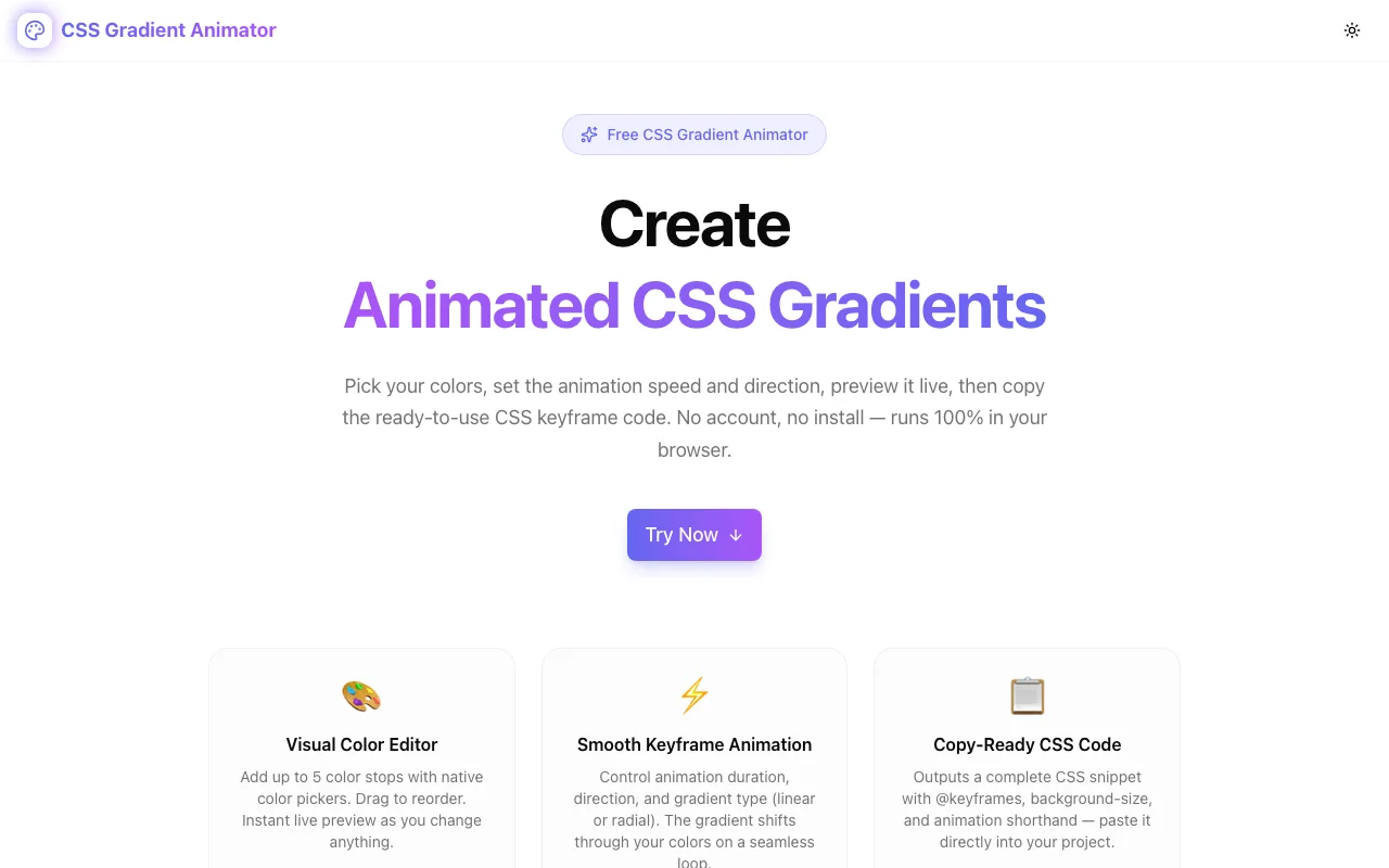
Design & CSS ToolsFeatured
CSS Gradient Animator
Free browser-based CSS gradient animator. Design animated gradients with live preview, then copy the complete @keyframes CSS code — no login, 100% client-side.
CSSGradientsAnimationFrontendDesignNext.jsTypeScript
Start Similar ProjectAbout the Project
CSS Gradient Animator — Live Preview + Copy-Ready CSS Code
CSS Gradient Animator lets frontend developers and designers create beautiful animated CSS gradients in seconds. Pick your colors, choose gradient type and direction, set the animation speed, and copy production-ready CSS keyframe code directly into your project — no login, no install, no backend.
The Problem
Animated gradients are one of the most visually impactful effects you can add to a UI with pure CSS. Shifting backgrounds, flowing hero sections, gradient borders, animated buttons — they work in every browser and require zero JavaScript.
But writing the animation by hand is tedious:
- You need to pick 2–5 colors that work together
- You need to know the
background-size: 400% 400%trick - You need to write
@keyframeswith the correctbackground-positionoffsets - You need to wire up the
animationshorthand correctly - You can't preview what it looks like without running the code
Most developers end up copying snippets from Stack Overflow, tweaking hex values by hand, refreshing the browser, and iterating blind. There's no visual feedback loop.
CSS Gradient Animator fixes that with an instant visual preview that updates in real time as you make changes, plus a single button to copy the complete CSS output.
How It Works
Choose Your Colors
Open the tool and you immediately see three default color stops — an indigo-to-purple-to-pink gradient. Click any swatch to open the native browser color picker and change the color. The live preview updates instantly.
Add more stops (up to 5) with the Add Color button. Remove any stop with the × button. You need at least 2 colors; the tool enforces this to prevent invalid CSS.
Set Gradient Type
Switch between:
- Linear — the classic left-to-right (or any direction) gradient
- Radial — an elliptical gradient emanating from the center
Pick a Direction (Linear Only)
For linear gradients, choose from 8 directions using the arrow button grid: →, ←, ↓, ↑, ↘, ↙, ↗, ↖. The preview updates immediately.
Control Animation Speed
Drag the speed slider from 1 second (fast) to 20 seconds (slow). The live preview reflects the speed in real time — you see the animation playing at exactly the duration you choose.
Copy the CSS
Click Copy CSS to copy a complete snippet to your clipboard:
.animated-gradient {
  background: linear-gradient(to right, #6366f1, #a855f7, #ec4899);
  background-size: 400% 400%;
  animation: gradientShift 6s ease infinite;
}

@keyframes gradientShift {
  0%   { background-position: 0% 50%; }
  50%  { background-position: 100% 50%; }
  100% { background-position: 0% 50%; }
}
Paste this directly into your stylesheet. Apply the class to any element. Done.
Technical Implementation
Core Technologies
- Next.js 16 with App Router
- TypeScript in strict mode
- Tailwind CSS v4 with OKLCH brand color tokens
- shadcn/ui for accessible UI components
- Framer Motion for section and tool entry animations
How the Animation Works
The CSS animation technique behind this tool is the background-size trick:
- Set
background-size: 400% 400%— the gradient is 4× larger than the element - Animate
background-positionfrom0% 50%to100% 50%and back via@keyframes - Because the background is oversized, the position shift slides the visible window across the gradient, creating the illusion of flowing colour
This approach works in all modern browsers, has no JavaScript dependency, and is GPU-accelerated via the compositor. It's the same technique used in the GitHub loading animation, Stripe's homepage, and thousands of SaaS landing pages.
Why Pure CSS (No SVG, No Canvas, No JS)
- Zero bundle size impact — no library, just a CSS class and a
@keyframesrule - GPU-accelerated —
background-positionanimates on the compositor thread - Infinite loop —
animation: ease infiniterequires no JS event handling - Composable — works on any HTML element; just add the class
Architecture
CssGradientAnimatorToolis a self-contained client component- Color stops managed in local React state — no global state, no context
buildGradientCSS()andbuildCSSOutput()are pure functions — easy to test- Live preview uses an inline
<style>injection for the@keyframesrule - Native
<input type="color">for the color picker — no library dependency
Privacy
- No account — no sign-in, no email
- No server calls — 100% static, no API routes
- No data collection — your color choices never leave the browser
Use Cases
Landing Page Hero Sections
The most common use case: a flowing, animated gradient behind the hero headline. Works especially well for SaaS, design agencies, and portfolio sites.
.hero {
  background: linear-gradient(to bottom right, #6366f1, #a855f7, #ec4899);
  background-size: 400% 400%;
  animation: gradientShift 8s ease infinite;
  min-height: 100vh;
}
Animated Buttons and CTAs
Animated gradient buttons attract more clicks. Apply the class to a <button> with border-radius and color: white.
Card Accent Borders
Use the gradient as a background on a wrapper element, with a slightly-smaller inner card on top. Creates a glowing animated border effect with pure CSS.
Loading Skeleton Screens
A slow, subtle animated gradient (12s–16s duration) makes skeleton loaders feel less static and more polished than a flat grey block.
Dark Mode Hero Backgrounds
Darker color stops (deep purple, midnight blue, charcoal) with a slow animation (10s+) give dark-mode landing pages depth without requiring any images.
Why CSS Gradient Animator?
vs. Writing It by Hand
- No memorisation — you don't need to remember the
background-size: 400% 400%trick - Instant preview — see the animation before you copy anything
- Color picker — native, no keyboard-only hex editing
vs. CSS Gradient Generators That Don't Animate
Most gradient generators produce a static background: linear-gradient(...) line. That's useful, but it doesn't give you the animation. This tool outputs the full animated snippet in one click.
vs. Codepen / JSFiddle
No setup, no saving, no account. Open the URL, tweak the colours, copy the CSS, close the tab. The whole workflow takes under a minute.
Try it now: css-gradient-animator.tools.jagodana.com
The Challenge
The client needed a robust design & css tools solution that could scale with their growing user base while maintaining a seamless user experience across all devices.
The Solution
We built a modern application using CSS and Gradients, focusing on performance, accessibility, and a delightful user experience.
Project Details
Category
Design & CSS Tools
Technologies
CSS,Gradients,Animation,Frontend,Design,Next.js,TypeScript
Date
July 2026