Back to Projects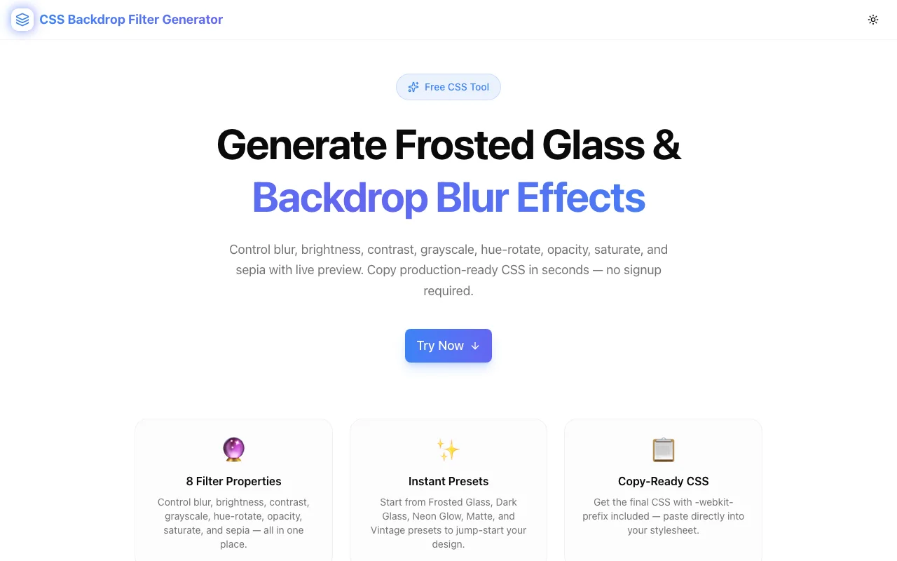
Developer ToolsFeatured
CSS Backdrop Filter Generator
A free visual tool to generate CSS backdrop-filter effects — blur, brightness, contrast, grayscale, hue-rotate, invert, opacity, saturate, and sepia — with live preview and copy-ready CSS output. No signup required.
CSSBackdrop FilterFrosted GlassDeveloper ToolsFrontendNext.jsTypeScript
Start Similar ProjectAbout the Project
CSS Backdrop Filter Generator — Visual Frosted Glass & Blur Effect Builder
CSS Backdrop Filter Generator is a free browser-based tool for creating backdrop-filter CSS effects with a live preview. Adjust blur, brightness, contrast, grayscale, hue-rotate, invert, opacity, saturate, and sepia using sliders — the preview updates instantly, and the CSS output is always one click away. No signup, no install.
The Problem
Frosted glass is one of the most popular UI patterns in modern web design. Translucent cards with a subtle blur behind them appear everywhere — dashboards, navigation bars, modals, hero sections. The CSS behind it is backdrop-filter, a property that applies graphical effects to the area behind an element rather than the element itself.
The property looks simple on paper:
backdrop-filter: blur(12px) brightness(1.1);
-webkit-backdrop-filter: blur(12px) brightness(1.1);
In practice, it is harder than it looks:
- Eight separate functions — blur, brightness, contrast, grayscale, hue-rotate, invert, opacity, saturate, sepia — each with its own unit and default value.
- No visual reference — writing values by hand means saving, refreshing, comparing, adjusting. The feedback loop is slow.
- Vendor prefix — Safari still requires
-webkit-backdrop-filter, which is easy to forget and frustrating to debug when your frosted card renders correctly in Chrome but breaks in Safari. - Background dependency — the effect only shows when the element has a semi-transparent background. Setting the wrong background color makes the blur invisible without explaining why.
How It Works
1. Preset Shortcuts
The tool ships with six presets: Frosted Glass, Dark Glass, Neon Glow, Matte, Vintage, and Clear. Each preset sets all eight filter properties to a curated starting point. Click a preset to load it, then adjust individual sliders from there.
Presets solve the blank-canvas problem. Frosted Glass (blur 12px, default brightness and contrast) is the right starting point for most use cases. Dark Glass reduces brightness and raises contrast for dark-mode cards. Neon Glow shifts the hue 180 degrees and cranks saturation for a vibrant, electric look.
2. Eight Sliders, Instant Preview
Each of the eight backdrop-filter functions has a dedicated slider:
| Property | Range | Unit | |---|---|---| | Blur | 0–50 | px | | Brightness | 0–200 | % | | Contrast | 0–200 | % | | Grayscale | 0–100 | % | | Hue Rotate | 0–360 | deg | | Invert | 0–100 | % | | Opacity | 0–100 | % | | Saturate | 0–300 | % | | Sepia | 0–100 | % |
Move any slider and the frosted card in the preview updates in real time. The preview renders against a colorful gradient background so the effect of each filter is clearly visible — including the absence of blur when the value is zero.
3. Live Preview Panel
The preview shows a frosted element positioned over a vibrant gradient background with decorative content behind it. This mirrors the real-world use case: a translucent card overlaid on a rich background image or gradient.
The preview element has a semi-transparent white background (rgba(255,255,255,0.15)) and a subtle white border. When you change filter values, the card updates instantly, so there is no guessing about how the final CSS will render in a browser.
4. Copy-Ready CSS Output
The generated CSS output includes:
.frosted-element {
  backdrop-filter: blur(12px);
  -webkit-backdrop-filter: blur(12px);
  background: rgba(255, 255, 255, 0.15);
  border: 1px solid rgba(255, 255, 255, 0.2);
  border-radius: 12px;
}
The -webkit-backdrop-filter line is always included. Click "Copy CSS" to get the full declaration on your clipboard.
The backdrop-filter value line only includes properties that differ from the default (e.g., blur(0px) is omitted because zero blur has no effect). This produces clean, minimal output rather than a bloated string with redundant no-op values.
Key Features
- Six presets — Frosted Glass, Dark Glass, Neon Glow, Matte, Vintage, Clear
- Eight filter properties — full coverage of all
backdrop-filterfunctions - Real-time preview — updates instantly as you move any slider
- Gradient background — makes filter effects clearly visible in the preview
- -webkit-backdrop-filter included — Safari compatibility in every output
- Minimal CSS output — only changed values are written, no redundant defaults
- One-click copy — full CSS declaration on your clipboard
- Fully client-side — no data sent to any server
- No signup required — open and start generating immediately
Technical Implementation
Core Technologies
- Next.js 16 with App Router
- TypeScript in strict mode
- Tailwind CSS v4 with OKLCH color tokens
- shadcn/ui components (new-york style)
- framer-motion for preview transitions
- Pure client-side — no external API calls
Architecture
The tool maintains a FilterState object with all nine filter property values. A buildFilterString() function converts the state to a backdrop-filter value string, omitting properties at their defaults. The preview element's backdropFilter style is set directly via inline styles, which means the browser renders the actual CSS property — not a simulation.
Framer Motion provides a subtle scale animation on the preview card when the filter string changes, confirming to the user that the change was applied.
The CSS output function generates a complete .frosted-element class ready to copy-paste, including the recommended background and border for frosted glass contexts.
Use Cases
Navigation Bars with Depth
Sticky navigation bars that blur the page content scrolling behind them are one of the most common uses of backdrop-filter. Use the generator to find the right blur amount — too low and the blur is invisible, too high and the content behind it becomes unreadable.
Modal Backdrops
A modal overlay with backdrop-filter: blur(4px) creates a dramatic depth effect by visually separating the modal from the page content. The generator lets you preview the exact blur amount without writing any CSS.
Dashboard Cards on Gradient Backgrounds
Analytics dashboards often place translucent cards over a gradient background. The Matte preset (blur 20px, slight grayscale) is a good starting point for neutral, professional card styles that do not distract from the data.
Hero Sections with Frosted UI
Landing pages that use full-bleed photography or video as a background can layer frosted glass cards over the media. The generator helps dial in the balance between enough blur to make text readable and enough transparency to let the background show through.
Dark Mode Glass Effects
The Dark Glass preset reduces brightness and increases contrast. Applied to a card on a dark gradient, it produces a realistic dark glass effect — common in dark-mode dashboards and developer tools.
Learning backdrop-filter
backdrop-filter is one of the CSS properties where the relationship between value and visual output is non-obvious. Moving the grayscale slider from 0% to 100% while watching the preview change explains the property more effectively than reading a specification.
Browser Support
backdrop-filter is supported in Chrome 76+, Firefox 103+, Safari 9+ (with -webkit- prefix), and Edge 79+. This covers well over 96% of global browser usage.
The generated CSS always includes -webkit-backdrop-filter: value as the second line. The tool's output works correctly in Safari without any modification.
For Firefox versions before 103, backdrop-filter requires enabling layout.css.backdrop-filter.enabled in about:config. The generated CSS will not trigger this automatically — Firefox users on older versions simply will not see the blur effect.
Why CSS Backdrop Filter Generator?
vs. Writing CSS Manually
- No trial-and-error — see the result before writing any code
- Eight properties, no memorization — slider labels tell you what each function does
- Safari prefix always included — never ship a blur that breaks in Safari
vs. Other CSS Tools
- backdrop-filter specific — not a general filter tool; focused on what makes frosted glass work
- Presets for real patterns — starting points based on actual UI patterns, not abstract demonstrations
- Minimal output — only non-default values appear in the CSS; no noise
vs. Design Tools (Figma, Sketch)
- Direct browser CSS — design tools approximate blur visually but do not generate the CSS
backdrop-filterproperty - What you see is what the browser renders — the preview uses the actual CSS applied in a browser, not a rendering approximation
Results
CSS Backdrop Filter Generator removes friction from frosted glass implementation:
- Instant visual feedback — no file saves, no page refreshes, no guessing
- Correct output every time —
-webkit-backdrop-filterincluded automatically - Faster experimentation — try eight filter combinations in the time it takes to write two lines of CSS
Try it now: css-backdrop-filter-generator.tools.jagodana.com
The Challenge
The client needed a robust developer tools solution that could scale with their growing user base while maintaining a seamless user experience across all devices.
The Solution
We built a modern application using CSS and Backdrop Filter, focusing on performance, accessibility, and a delightful user experience.
Project Details
Category
Developer Tools
Technologies
CSS,Backdrop Filter,Frosted Glass,Developer Tools,Frontend,Next.js,TypeScript
Date
June 2026
Related Projects
More work in Developer Tools