Back to Projects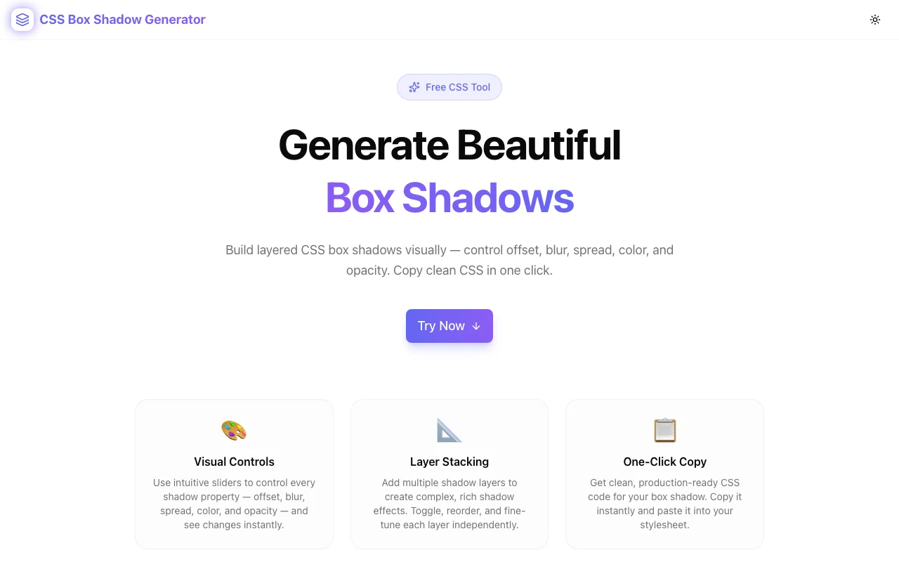
Developer ToolsFeatured
CSS Box Shadow Generator
A free visual tool to create, stack, and customize CSS box shadows — control offset, blur, spread, color, and opacity with live preview. Copy production-ready CSS instantly, no login required.
CSSBox ShadowDeveloper ToolsDesign ToolsFrontendNext.jsTypeScript
Start Similar ProjectAbout the Project
CSS Box Shadow Generator — Create Beautiful Box Shadows Online
The CSS Box Shadow Generator is a free, browser-based tool that lets developers and designers build perfect box-shadow CSS values visually — no guesswork, no trial-and-error in DevTools. Stack multiple layers, toggle inset shadows, preview against different backgrounds, and copy clean CSS in one click.
The Problem
Writing CSS box-shadow by hand is tedious. The syntax is cryptic — six parameters (inset, X, Y, blur, spread, color) — and iterating on shadow aesthetics means constant back-and-forth between your code editor and the browser. Stacking multiple layers makes it even harder to manage.
Developers lose minutes every time they need a polished shadow effect. Designers lose context when they try to translate their Figma shadows into CSS. And both audiences struggle to achieve layered, realistic shadow depth without a dedicated tool.
How It Works
1. Visual Controls
Every shadow parameter is exposed as an interactive slider:
- Offset X / Offset Y — position the shadow on any axis from -100px to +100px
- Blur radius — control softness from 0 (hard edge) to 150px (ultra-soft)
- Spread radius — expand or contract the shadow from -50px to +100px
- Color picker — hex color input + native color picker for precision
- Opacity — control alpha separately from the hex color (0–100%)
- Inset toggle — switch between outer and inner shadows instantly
All changes update the live preview in real time with no page reload.
2. Layer Stacking
CSS's box-shadow property accepts comma-separated values, enabling multiple shadow layers on a single element. The generator lets you:
- Add unlimited shadow layers
- Toggle individual layers on or off (without deleting them)
- Expand a single layer to edit its controls
- Delete layers you no longer need
- Stack inset and outer shadows on the same element
This makes it easy to build complex, layered shadow effects like Material Design's elevation system or multi-tone glow effects.
3. Preset Gallery
Six curated presets ship out of the box:
| Preset | Effect | |---|---| | Soft Lift | Subtle two-layer shadow for cards and panels | | Material | Three-layer shadow replicating Material Design elevation | | Hard Shadow | Crisp zero-blur shadow for retro and brutalist UIs | | Neon Glow | Colorful two-tone glow effect for dark-mode UIs | | Inner Glow | Inset glow for pressed/active states | | Floating Card | Large, diffuse shadow for heavily elevated surfaces |
Apply any preset instantly and then customize from that starting point.
4. Live Preview Backgrounds
Shadow visibility varies dramatically based on background color. The preview panel lets you switch between four background options:
- Light — white background (default)
- Dark — dark zinc background for dark-mode shadows
- Gradient — subtle violet-indigo gradient for mid-tone surfaces
- Checker — checkerboard pattern to see true alpha transparency
5. CSS Output
The generated box-shadow value is displayed as syntax-highlighted CSS. Two output formats are provided:
- Single property — just the
box-shadowvalue for dropping into existing rules - Full snippet — complete
.my-element { box-shadow: ...; }ready to paste
A single click copies either output to your clipboard with a toast confirmation.
Key Features
- Multiple shadow layers — stack unlimited shadows on one element
- 6 built-in presets — start with professional shadow recipes
- Inset shadow support — inner glow and pressed-state effects
- 4 preview backgrounds — light, dark, gradient, checkerboard
- Opacity control — separate from color hex for precise alpha
- Syntax-highlighted output — easier to read and verify
- One-click copy — clipboard access with visual confirmation
- No login required — start immediately, no account needed
- Fully client-side — no data ever leaves your browser
Technical Implementation
Core Technologies
- Next.js 16 with App Router
- TypeScript in strict mode
- Tailwind CSS v4 with OKLCH color tokens
- shadcn/ui (new-york) for accessible components
- framer-motion for animations
- Vercel for deployment and edge CDN
Architecture
The entire tool runs as a single "use client" React component. Shadow state is managed locally with useState, and the box-shadow CSS string is computed from the layer array on every render — no debouncing required because the computation is trivial.
The hexToRgba() utility converts hex + opacity into rgba() so every shadow layer gets accurate alpha control without relying on hex8 color notation (which has inconsistent browser support in older projects).
Use Cases
Frontend Development
You're styling a card component and need a shadow that lifts it off the page without looking heavy. Use the Soft Lift preset, tweak the blur and opacity, and copy the CSS — done in 30 seconds.
Dark Mode Design
Shadows behave differently on dark backgrounds. Switch the preview to Dark mode, switch to the Neon Glow preset, and dial in a colored glow that actually reads against a dark surface.
Design System Work
You're building a design system with three elevation levels. Use the Layer Stacking feature to create each level's shadow, copy the CSS values, and document them as your system's shadow tokens.
Learning CSS Shadows
New to box-shadow? Move the sliders and watch how each parameter affects the output. The live preview + CSS output pairing makes it a perfect interactive learning tool.
Why CSS Box Shadow Generator?
vs. Browser DevTools
- Visual controls — sliders instead of typing values
- Layer management — easy to manage multiple layers
- Presets — starting points instead of blank slates
- Copy-ready output — formatted and ready to paste
vs. MDN Reference
- Interactive — see results as you change values
- Multi-layer — easily create stacked shadow effects
- Presets — reference aesthetic examples, not just syntax
vs. Figma Drop Shadow
- CSS native — outputs actual
box-shadowsyntax, not design tool values - Browser context — preview looks exactly like it will in a browser
- Free — no Figma account or plan required
Results
CSS Box Shadow Generator eliminates the iteration cycle between code editor and browser DevTools:
- Instant visual feedback — no browser refresh needed
- Correct syntax every time — no typos or parameter ordering mistakes
- Layer management — complex multi-shadow effects without manual string editing
- Preset starting points — professional results without starting from zero
Try it now: css-box-shadow-generator.tools.jagodana.com
The Challenge
The client needed a robust developer tools solution that could scale with their growing user base while maintaining a seamless user experience across all devices.
The Solution
We built a modern application using CSS and Box Shadow, focusing on performance, accessibility, and a delightful user experience.
Project Details
Category
Developer Tools
Technologies
CSS,Box Shadow,Developer Tools,Design Tools,Frontend,Next.js,TypeScript
Date
April 2026
Related Projects
More work in Developer Tools

