Back to Projects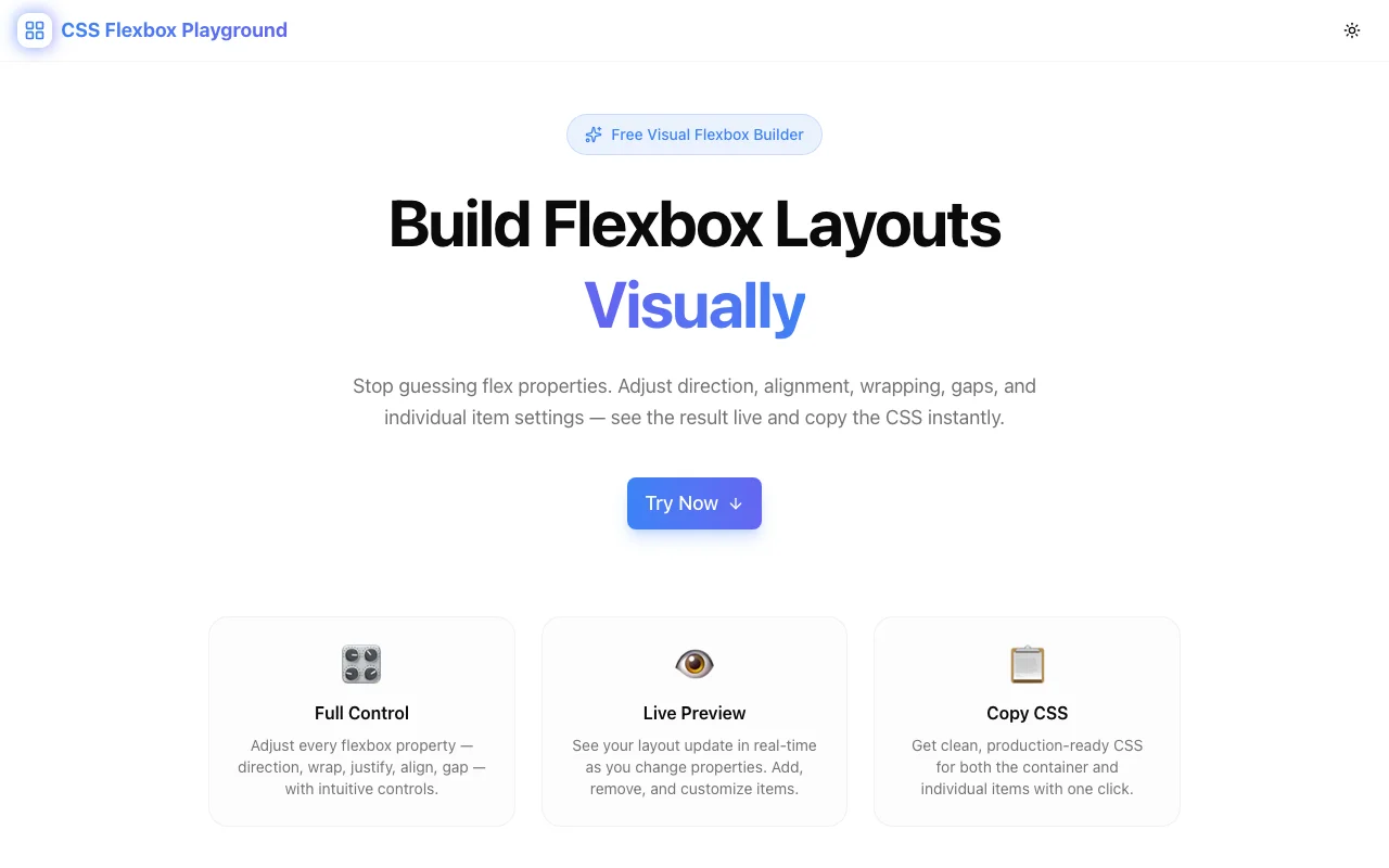
Developer ToolsFeatured
CSS Flexbox Playground
A free visual tool for experimenting with CSS Flexbox properties in real time—adjust container and item settings, preview layout changes instantly, and copy production-ready CSS with one click. No signup required.
CSS FlexboxVisual BuilderDeveloper ToolsFrontendNext.jsTypeScript
Start Similar ProjectAbout the Project
CSS Flexbox Playground — Interactive Visual Flexbox Builder
CSS Flexbox Playground is a free, browser-based tool for experimenting with CSS Flexbox properties in real time. Adjust container and item-level controls, watch the layout respond instantly, and copy clean production-ready CSS with one click—no signup, no install required.
The Problem
Flexbox is the most widely used CSS layout method—and one of the most confusing to write from scratch. justify-content, align-items, flex-wrap, align-self, flex-grow—each property is documented, but knowing how they interact in a live layout is a different challenge entirely.
The typical development loop looks like this:
- Write some flex properties in a stylesheet
- Save and switch to the browser
- The layout isn't quite right—maybe items aren't wrapping the way you expected
- Back to the editor, adjust a value, save again
- Repeat until it looks right, never entirely sure which property did what
This cycle is slow and opaque. Flexbox properties interact in non-obvious ways, and a single property change can shift the entire layout. Without instant visual feedback, developers spend more time debugging than designing.
How It Works
1. Container Controls
Set the flex container properties using segmented buttons and sliders:
flex-direction— row, row-reverse, column, column-reverseflex-wrap— nowrap, wrap, wrap-reversejustify-content— flex-start, flex-end, center, space-between, space-around, space-evenlyalign-items— flex-start, flex-end, center, baseline, stretchalign-content— all six values for multi-line containersgap— row-gap and column-gap in pixels
2. Item-Level Controls
Click any flex item to edit its individual properties:
flex-grow— how much the item grows relative to siblingsflex-shrink— how much the item shrinks when space is tightflex-basis— the initial main-axis size before growing or shrinkingalign-self— override the container'salign-itemsfor a single itemorder— visual reordering without changing HTML
Add up to 12 flex items to the canvas. Resize the preview to see how your layout behaves at different viewport widths.
3. Preset Layouts
Start from five common patterns instead of a blank canvas:
- Centered — single item centered both axes
- Navigation bar — logo left, links right
- Card row — evenly spaced cards with wrapping
- Sidebar layout — fixed sidebar, flexible content area
- Stack — vertical column with consistent spacing
Select a preset, then customize from there. Most layouts are one or two property changes away from what you actually need.
4. Live CSS Output
The generated CSS updates in real time as you adjust any control. The output panel shows the complete, copy-paste-ready CSS for both the container and each item:
.container {
  display: flex;
  flex-direction: row;
  flex-wrap: wrap;
  justify-content: space-between;
  align-items: center;
  gap: 16px;
}

.item-2 {
  flex-grow: 2;
  align-self: flex-start;
}
No abbreviated properties. No framework-specific output. Just valid CSS that works in any project.
5. One-Click Copy
Copy the complete CSS to your clipboard with one click. Container and item styles are included. Paste it into your stylesheet and you're done.
Key Features
- Segmented buttons for all enum properties—faster than dropdowns, no value memorization
- Per-item editing — click any item to configure
flex-grow,flex-shrink,flex-basis,align-self, andorder - Up to 12 flex items with click-to-edit content
- 5 preset layouts for quick-start prototyping
- Smooth reflow animations (300ms ease) on property changes
- Real-time CSS output — generated CSS updates as you design
- One-click copy — grab the CSS instantly
- Responsive preview — resize to see wrap and overflow behavior
- Client-side only — no data leaves your browser
- No signup required — open the URL and start building
Technical Implementation
Core Technologies
- Next.js with App Router
- TypeScript in strict mode
- TailwindCSS for styling
- shadcn/ui for accessible components
Architecture
- 320px sidebar controls panel + live flex canvas + CSS output panel
- All flex calculations run client-side—no server dependency
- Real-time CSS generation from component state
- Responsive container preview with drag-to-resize
Use Cases
Frontend Development
You need a navigation bar with the logo left-aligned and nav links right-aligned, centered vertically. Instead of writing and reloading to test justify-content: space-between vs. align-items: center, build it visually in 30 seconds and copy the exact CSS.
Learning Flexbox
Flexbox properties are best understood through direct manipulation, not documentation. The playground creates an immediate feedback loop: change a property, see what happens. Toggle flex-wrap, watch items break into rows. Increase flex-grow on one item, watch it claim more space. Build the intuition that no amount of reading can replace.
Cross-Browser Layout Debugging
When a flex layout behaves unexpectedly in production, reproducing the structure in the playground makes it easier to isolate which property is causing the issue. Adjust properties one at a time against a clean environment.
Design Handoff
A designer specifies a card grid with specific spacing and alignment rules. Recreate the layout in the playground, copy the CSS, and hand off precise, validated properties rather than guessing at what the design intends.
Prototyping Components
Before reaching for a UI framework's layout utilities, prototype the component in the playground to understand exactly what flex properties you need. The result is leaner, more intentional CSS.
Why CSS Flexbox Playground?
vs. css-grid-generator
- Different layout model — Flexbox is inherently one-dimensional; Grid handles two. Use this tool when you're distributing items along a single axis.
- Item-level properties —
flex-grow,flex-shrink,align-selfare first-class controls, not afterthoughts - Most-used layout method — Flexbox powers more web UI than Grid; closing the tooling gap matters
vs. Browser DevTools
- Build from scratch — DevTools let you inspect existing flex containers; this tool lets you design them from zero
- Visual controls — segmented buttons and sliders are faster than editing raw property values in the inspector
- Copy-ready output — one click to clipboard vs. manually transcribing from computed styles
vs. Writing CSS Directly
- Instant feedback — no save-reload cycle
- Property discovery — see all available values in the UI without looking them up
- No syntax errors — the tool generates valid CSS every time
- Exploration — try combinations you wouldn't bother hand-coding
Results
CSS Flexbox Playground removes the guesswork from flex layouts:
- Visual design — build layouts by adjusting controls, not writing CSS blind
- Instant feedback — every property change reflects immediately in the preview
- Zero friction — open a URL, design a layout, copy the CSS, done
- Privacy by default — everything runs in your browser
Try it now: css-flexbox-playground.tools.jagodana.com
The Challenge
The client needed a robust developer tools solution that could scale with their growing user base while maintaining a seamless user experience across all devices.
The Solution
We built a modern application using CSS Flexbox and Visual Builder, focusing on performance, accessibility, and a delightful user experience.
Project Details
Category
Developer Tools
Technologies
CSS Flexbox,Visual Builder,Developer Tools,Frontend,Next.js,TypeScript
Date
April 2026
Related Projects
More work in Developer Tools

