Back to Projects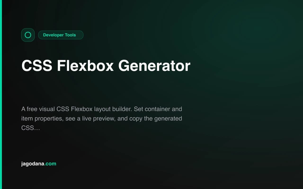
Developer ToolsFeatured
CSS Flexbox Generator
A free visual CSS Flexbox layout builder. Set container and item properties, see a live preview, and copy the generated CSS instantly — no account required.
CSSFlexboxLayoutDeveloper ToolsFrontendNext.jsTypeScript
Start Similar ProjectAbout the Project
CSS Flexbox Generator — Visual Flexbox Layout Builder
CSS Flexbox Generator is a free, browser-based tool that lets you build CSS flexbox layouts visually. Adjust container properties (flex-direction, justify-content, align-items, flex-wrap, gap) and per-item settings (flex-grow, flex-shrink, flex-basis, align-self), watch the live preview update instantly, and copy the generated CSS with one click. No account, no install, nothing to configure.
The Problem
CSS Flexbox is one of the most powerful layout tools in the browser, but getting all the properties right requires keeping a mental model of axes, alignment, and item sizing simultaneously. When does justify-content: space-between stop working? Which axis does align-items control? What actually happens when flex-basis and flex-grow interact?
Most developers solve this through trial and error: write some CSS, reload the browser, adjust a value, reload again. For layouts with multiple items and specific per-item behavior, this loop gets expensive. Flexbox properties are not independently readable — the result of combining flex-direction, justify-content, and a mix of flex-grow values only becomes clear when you see them together.
There is also the documentation gap. MDN explains every property individually but does not show how they combine. Interactive playgrounds exist but are often cluttered with settings you do not need.
CSS Flexbox Generator is the focused answer: one tool, all the controls that matter, a live preview, and clean output.
How It Works
1. Container Properties
Set all the relevant flex container properties from a clean control panel:
- flex-direction —
row,row-reverse,column,column-reverse - justify-content —
flex-start,flex-end,center,space-between,space-around,space-evenly - align-items —
flex-start,flex-end,center,stretch,baseline - flex-wrap —
nowrap,wrap,wrap-reverse - align-content — appears when wrap is enabled:
flex-start,flex-end,center,stretch,space-between,space-around - gap — pixel value for both row and column gap
- container height — adjustable for testing alignment in taller containers
Changes apply instantly — the preview updates as you adjust each control.
2. Flex Items
Add up to 10 flex items and configure each one independently:
- flex-grow — how much the item grows relative to siblings (0 = no growth)
- flex-shrink — how much the item shrinks when space is tight (1 = default shrink behavior)
- flex-basis — the starting size of the item before growing/shrinking (
auto,px,%,rem) - align-self — per-item override for the container's
align-itemssetting
Each item is selectable by clicking in the preview or using the tab buttons. The selected item's controls update live.
3. Live Visual Preview
The preview renders a real flexbox layout using your exact settings. The container uses the same CSS that will be copied — there is no simulation or approximation. What you see in the preview is the exact output your users will see in a browser.
Items display in distinct colors with their label text. Clicking an item in the preview selects it for editing.
4. Generated CSS
The CSS output panel shows clean, formatted CSS that includes only the properties that differ from browser defaults. If flex-direction is row (the default), it is not included in the output. If flex-shrink is 1 (the default) and flex-grow is 0, the flex shorthand is omitted for that item.
The result is production-ready CSS with no noise:
.flex-container {
  display: flex;
  justify-content: space-between;
  align-items: center;
  gap: 16px;
}

.flex-item-2 {
  flex: 2 1 auto;
}
Click Copy CSS to send it to the clipboard.
Key Features
- All container properties — direction, justify, align, wrap, gap, and align-content
- Per-item flex settings — grow, shrink, basis, and align-self per item
- Up to 10 items — add and remove freely
- Real-time preview — layout updates as you change any property
- Smart CSS output — only outputs non-default values
- One-click copy — clipboard API integration with feedback toast
- Fully client-side — no data leaves the browser
- No account required — open, adjust, copy, done
Technical Implementation
Core Technologies
- Next.js 16 with App Router
- TypeScript in strict mode
- Tailwind CSS v4 for styling
- shadcn/ui component library
- Framer Motion for page animations
- Sonner for toast notifications
- 100% client-side — zero external API dependencies
Architecture
The tool is a single React component (css-flexbox-generator-tool.tsx) with:
- Container state:
flexDirection,justifyContent,alignItems,flexWrap,alignContent,gap,containerHeight - Item array state: each item holds
flexGrow,flexShrink,flexBasis,alignSelf,label,bgColor - CSS generator function: produces clean CSS by comparing current values to defaults
- Clipboard integration via the Web Clipboard API
No dependencies are added beyond the template stack.
Use Cases
Learning Flexbox
Flexbox is one of those topics that clicks visually. Change flex-direction to column and watch how justify-content switches from horizontal distribution to vertical. Toggle flex-wrap and see how align-content becomes relevant. The visual feedback makes abstract properties concrete in minutes.
Component Layout Design
When building a UI component — a navigation bar, a card footer, a form row, a badge cluster — you can prototype the flexbox layout before writing any component code. Set up the items that match your design, dial in the spacing and alignment, and copy the CSS directly into your stylesheet or CSS-in-JS.
Interview & Documentation Reference
Flexbox properties are a common interview topic. The generator makes a useful reference: show the expected behavior of each property combination without needing to maintain a local sandbox. It also works well as a documentation aid when explaining a layout decision to a teammate.
CSS Debugging
When a flex layout does not behave as expected in production, reproducing the layout in the generator confirms whether the issue is in the CSS properties or elsewhere (overflow, parent constraints, content size). Rebuild the layout, match the current CSS, and isolate the variable.
Rapid Prototyping
Paste the generated CSS into a CodePen or a Tailwind prototype. The generator outputs standard CSS properties, not utility classes, so it works anywhere.
Why CSS Flexbox Generator?
vs. Manual CSS
- See the result immediately — no browser refresh cycle
- Explore properties — try
space-evenlyvsspace-betweenwith a click, not a retype - No memorization needed — all valid option values are in the dropdowns
vs. MDN / CSS Tricks
- Interactive — documentation describes; the generator demonstrates
- Combined view — all properties visible together, not spread across separate articles
- Copyable output — ready to paste, not an example to adapt
vs. Tailwind Playground or similar
- Raw CSS output — no framework translation needed
- Per-item controls — Tailwind class pickers don't expose flex-basis or align-self per child easily
- No install — works in any project regardless of stack
Results
CSS Flexbox Generator makes layout work faster and learning stick faster:
- No refresh cycle — see the result of every change immediately
- Smart output — copy only what you need, no bloated default properties
- Any browser, any project — standard CSS, no dependencies
- Five seconds to useful — open, adjust, copy
Try it now: css-flexbox-generator.tools.jagodana.com
The Challenge
The client needed a robust developer tools solution that could scale with their growing user base while maintaining a seamless user experience across all devices.
The Solution
We built a modern application using CSS and Flexbox, focusing on performance, accessibility, and a delightful user experience.
Project Details
Category
Developer Tools
Technologies
CSS,Flexbox,Layout,Developer Tools,Frontend,Next.js,TypeScript
Date
July 2026
Related Projects
More work in Developer Tools