How to Create an Animated CSS Gradient Background (No JavaScript Required)
Learn how animated CSS gradients work — background-size, background-position, and @keyframes — and use a free online tool to generate the code instantly.
How to Create an Animated CSS Gradient Background (No JavaScript Required)
Animated gradient backgrounds are one of the most effective visual effects you can add to a web page with nothing but CSS. You've seen them on Stripe, Linear, Vercel, and a hundred SaaS landing pages — that subtle, flowing colour shift that makes a hero section feel alive.
The good news: it's surprisingly simple to implement. The bad news: the technique is non-obvious if you've never seen it before.
This post explains exactly how it works, when to use it, and how to generate the code instantly without writing a line of CSS.
How Does an Animated CSS Gradient Work?
The trick uses three CSS properties together:
1. background-size: 400% 400%
A normal linear-gradient fills exactly 100% of its container. When you set background-size to 400%, the gradient is rendered four times larger than the element. Only a portion of it is visible at any time.
Think of it as a painting four times the size of your window: you can only see one quarter, but you can move the canvas around to reveal different parts.
2. @keyframes with background-position
You animate background-position from 0% 50% to 100% 50% and back. This slides the oversized gradient across the element — as if you're panning the camera across that large painting.
@keyframes gradientShift {
  0%   { background-position: 0% 50%; }
  50%  { background-position: 100% 50%; }
  100% { background-position: 0% 50%; }
}
The 50% on the vertical axis keeps the pan horizontal. Adjusting these values changes the direction of the sweep.
3. animation: gradientShift Ns ease infinite
Wire the keyframe to the element and set it to loop forever. The ease timing function makes the transition feel smooth rather than mechanical.
.hero {
  background: linear-gradient(to right, #6366f1, #a855f7, #ec4899);
  background-size: 400% 400%;
  animation: gradientShift 6s ease infinite;
}
That's the complete implementation. No JavaScript, no library, no SVG, no canvas.
Why Does This Work So Well in Browsers?
GPU Acceleration
background-position is a composited property on modern browsers. The animation runs on the GPU compositor thread, not the main thread — meaning it won't jank even when your page is doing heavy JavaScript work.
Zero Bundle Size Impact
This is pure CSS. It adds a single class and a @keyframes rule to your stylesheet — typically less than 200 bytes. Compared to a JavaScript-based particle effect or a video background, the performance cost is negligible.
Universal Browser Support
linear-gradient, background-size, and @keyframes are supported in every browser released in the last decade. No polyfill, no prefix, no feature detection required.
What Are Animated CSS Gradients Good For?
Hero Section Backgrounds
The most common use case. A flowing gradient behind your headline draws the eye, adds depth, and signals that the site is designed — not just functional.
.hero-section {
  background: linear-gradient(to bottom right, #0f0c29, #302b63, #24243e);
  background-size: 400% 400%;
  animation: gradientShift 12s ease infinite;
  min-height: 100vh;
  display: flex;
  align-items: center;
  justify-content: center;
}
A slower speed (10s–16s) works better for hero sections — fast animations feel cheap; slow ones feel premium.
Animated Gradient Buttons
Animated CTA buttons perform well. The movement catches peripheral vision and draws clicks.
.cta-button {
  background: linear-gradient(to right, #6366f1, #a855f7, #ec4899, #6366f1);
  background-size: 300% 300%;
  animation: gradientShift 3s ease infinite;
  color: white;
  padding: 0.75rem 2rem;
  border-radius: 9999px;
  border: none;
  cursor: pointer;
}
Use a faster speed (3s–5s) for buttons — they're small, so the effect needs to be readable.
Animated Border Effect
Set the gradient on a wrapper div, and place a slightly smaller inner card on top of it. The gap becomes an animated gradient border.
.card-wrapper {
  background: linear-gradient(to bottom right, #6366f1, #ec4899);
  background-size: 400% 400%;
  animation: gradientShift 5s ease infinite;
  border-radius: 1rem;
  padding: 2px; /* The "border" width */
}

.card-inner {
  background: white;
  border-radius: calc(1rem - 2px);
  padding: 1.5rem;
}
Loading Skeleton Screens
Replace the static grey shimmer with a subtle animated gradient for a more polished loading state.
.skeleton {
  background: linear-gradient(90deg, #f0f0f0, #e0e0e0, #f0f0f0);
  background-size: 400% 100%;
  animation: gradientShift 1.5s ease infinite;
  border-radius: 0.5rem;
}
Dark-Mode Landing Pages
Deep purples, navy blues, and charcoals look stunning in slow animated gradients. They create depth without requiring any images or video.
Can You Use Radial Gradients Too?
Yes — the same technique works with radial-gradient:
.element {
  background: radial-gradient(ellipse at center, #6366f1, #a855f7, #ec4899);
  background-size: 400% 400%;
  animation: gradientShift 8s ease infinite;
}
The result is a pulsing, colour-shifting circular gradient. It works especially well as a background for icons or avatar placeholders.
How Many Color Stops Should You Use?
- 2 stops — clean, minimal. Works for subtle transitions.
- 3 stops — the sweet spot for most use cases. Enough variety to look interesting without becoming garish.
- 4–5 stops — vibrant, festival-poster energy. Works for bold CTAs, creative portfolios, or dark-mode landing pages. Use sparingly.
Color Pairing Tips
- Analogous colors (adjacent on the color wheel) — smooth, cohesive:
indigo → purple → pink - Complementary colors — high contrast, bold:
blue → orange - Monochromatic — sophisticated:
light purple → mid purple → deep purple - Triadic — vibrant and balanced:
red → yellow → blue
The CSS Gradient Animator lets you experiment visually until you find a combination that works — much faster than tweaking hex values by hand.
What Should You Watch Out For?
Accessibility: Reduced Motion
Some users have vestibular conditions that make motion sickness from animations a real problem. Always respect prefers-reduced-motion:
@media (prefers-reduced-motion: reduce) {
  .animated-gradient {
    animation: none;
  }
}
This pauses the animation for users who've opted out of motion in their OS settings.
Contrast on Text
Animated backgrounds shift color continuously, which can cause text contrast to fluctuate. Either:
- Avoid placing body text directly on an animated gradient
- Use a semi-transparent dark overlay under text
- Keep the gradient within a narrow hue range so contrast remains consistent
Performance at Scale
Animated gradients are cheap for a single element. If you're animating 50 card backgrounds simultaneously on a low-end device, GPU pressure adds up. Test on mid-range mobile hardware.
Generate Animated CSS Gradients Instantly
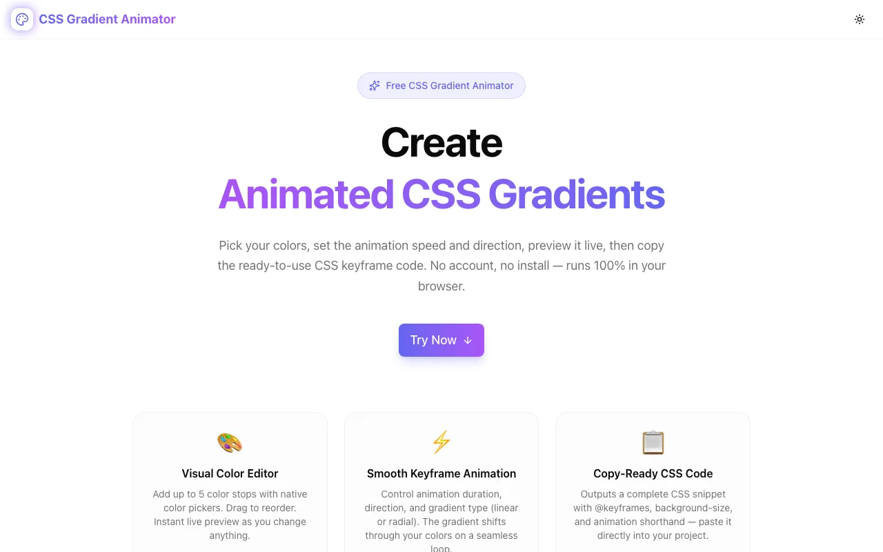
Instead of writing this from scratch, use CSS Gradient Animator — a free browser-based tool that generates the complete CSS output for you:
- Choose your colors — click the swatches to pick up to 5 color stops
- Set the type — linear or radial
- Pick a direction — 8 directions for linear gradients
- Control the speed — 1s to 20s animation duration
- Copy the CSS — one click copies the complete snippet with
@keyframes
The live preview shows you exactly what the animation looks like before you copy anything. No account, no install, works instantly in every modern browser.
Try it: css-gradient-animator.tools.jagodana.com
The Complete CSS Snippet
Here's the full pattern for reference:
/* Apply this class to any element */
.animated-gradient {
  background: linear-gradient(to right, #6366f1, #a855f7, #ec4899);
  background-size: 400% 400%;
  animation: gradientShift 6s ease infinite;
}

/* The keyframes rule — place once in your stylesheet */
@keyframes gradientShift {
  0%   { background-position: 0% 50%; }
  50%  { background-position: 100% 50%; }
  100% { background-position: 0% 50%; }
}

/* Respect reduced motion preferences */
@media (prefers-reduced-motion: reduce) {
  .animated-gradient {
    animation: none;
  }
}
Swap the hex values, adjust the duration, and you're done. The CSS Gradient Animator generates all of this for you — but now you understand exactly what each line does.
Built as part of the 365 Tools Challenge — building one small, useful tool for developers, designers, and product builders every day.