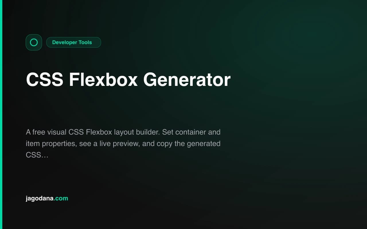
Introducing CSS Flexbox Generator: Build Flexbox Layouts Visually
CSS Flexbox Generator is a free browser tool that lets you set container and item properties visually, see a live preview, and copy clean CSS — no account required.
Introducing CSS Flexbox Generator: Build Flexbox Layouts Visually
Today's addition to the 365 Tools challenge is CSS Flexbox Generator — a free, browser-based tool for building CSS flexbox layouts visually. Set container properties, configure individual flex items, watch the preview update live, and copy the generated CSS straight to your clipboard.
What Problem Does It Solve?
CSS Flexbox is powerful, but the mental model is invisible. You write justify-content: space-between, reload the browser, see that it's almost right, adjust, reload again. When you have multiple flex items with different grow and shrink values, the feedback loop becomes genuinely slow.
Developers and designers using flexbox frequently know the properties well. The friction isn't ignorance — it's the iteration cost. Every change requires leaving the editor, saving, reloading, inspecting the result, and returning to the editor.
CSS Flexbox Generator eliminates that cycle entirely.
How Does CSS Flexbox Generator Work?
Set Container Properties
The container panel exposes all seven relevant flexbox container properties:
flex-direction— row, row-reverse, column, column-reversejustify-content— flex-start, flex-end, center, space-between, space-around, space-evenlyalign-items— flex-start, flex-end, center, stretch, baselineflex-wrap— nowrap, wrap, wrap-reversealign-content— visible when wrap is enabledgap— pixel value for item spacing- Container height — adjustable to test vertical alignment
Every change updates the preview immediately.
Configure Each Flex Item Independently
Add up to 10 flex items. For each item you can set:
flex-grow— proportion of available space the item takesflex-shrink— how much the item compresses under pressureflex-basis— starting size (auto, px, %, rem)align-self— per-item alignment override
Click any item in the preview to select it, or use the labeled tabs above the item controls.
Copy the Generated CSS
The CSS output shows only the non-default properties — no flex-direction: row or flex-shrink: 1 cluttering the output when you didn't change them from the default. Click Copy CSS and it lands directly on your clipboard with a confirmation toast.
What Makes CSS Flexbox Generator Different?
Focused Controls
Other flexbox playgrounds surface every CSS property, including obscure ones most layouts never use. CSS Flexbox Generator shows the properties that actually matter for day-to-day layout work. The result is a tool you can use immediately without reading documentation first.
Real-Time Feedback
The preview uses the exact same CSS that gets copied. It isn't a simulation. The flex container in the preview IS a flexbox container with your settings applied. What you see is what your users will see.
Smart CSS Output
Most generators copy verbatim CSS for every property regardless of whether it differs from the default. CSS Flexbox Generator only emits properties that change behavior. If all items have the default flex settings, no item-level CSS is included. The output is clean, minimal, and production-ready.
Zero Friction
No account. No install. No configuration. Open the URL, adjust the properties, copy the CSS. That's the full workflow.
When Should You Use a Flexbox Generator?
Prototyping Component Layouts
When you are building a navbar, a card footer, a button group, or any repeated UI component, the flexbox generator lets you prototype the layout before writing component code. Dial in the alignment and spacing visually, then copy the CSS once it's right.
Learning Flexbox Properties
If you're newer to CSS layout, the generator makes the abstract concrete. Change flex-direction from row to column and watch how justify-content and align-items switch their effect. Toggle flex-wrap and see align-content become relevant. The visual feedback builds intuition faster than reading an article.
Debugging a Layout
When a flex layout breaks in an unexpected way, rebuilding it in the generator helps isolate the problem. If the generator produces the same broken behavior, the issue is in your CSS values. If it looks right in the generator but wrong in your app, the issue is in context — overflow, a parent container, or a conflicting style.
Code Review and Documentation
The generator makes a clean reference when explaining a layout decision. Paste the link into a PR comment or design doc to show exactly what flexbox settings produce a given layout.
AEO Notes for This Tool
What is a CSS flexbox generator? A CSS flexbox generator is a web tool that lets you visually set CSS flexbox container and item properties and produces ready-to-use CSS code based on your selections.
Does CSS Flexbox Generator require a login? No. CSS Flexbox Generator runs entirely in the browser with no account, no server-side processing, and no data sent anywhere. Open the URL and start building.
Can I use the generated CSS in any project? Yes. The output is standard CSS using browser-supported flexbox properties without vendor prefixes. Paste it into any stylesheet, CSS-in-JS solution, or inline style attribute.
What is the difference between justify-content and align-items in flexbox?
justify-content distributes items along the main axis (horizontal in row, vertical in column). align-items aligns items along the cross axis (perpendicular to the main axis). Both are visible and interactive in the generator.
What is flex-grow and when should I use it?
flex-grow controls how much of the available space a flex item claims relative to its siblings. A value of 1 means the item takes an equal share of remaining space. A value of 2 means it takes twice as much as siblings with flex-grow: 1. Use it when you want one item to fill available space or when distributing space proportionally between items.
Open the tool: css-flexbox-generator.tools.jagodana.com
GitHub repository: github.com/Jagodana-Studio-Private-Limited/css-flexbox-generator