CSS Scroll-Driven Animations Without the Guesswork — Introducing Scroll-Driven Animation Builder
Learn how to use CSS scroll-driven animations with animation-timeline: scroll() and animation-range. A free visual builder lets you configure, preview, and copy production-ready CSS instantly.
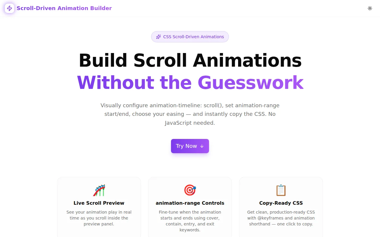
CSS Scroll-Driven Animations Without the Guesswork
CSS scroll-driven animations have been available in Chrome and Edge since version 115. The feature lets you link any CSS animation to a scroll container's progress — no JavaScript, no IntersectionObserver, no requestAnimationFrame. Just CSS.
But the syntax has enough moving parts that most developers still reach for JavaScript. This post explains how scroll-driven animations work, covers the properties that matter, and introduces Scroll-Driven Animation Builder — a free visual tool to configure and preview them without trial and error.
What Is a CSS Scroll-Driven Animation?
A CSS scroll-driven animation replaces the time-based animation model with a scroll-based one. Normally, animation-duration: 1s means the animation plays over one second. With animation-timeline: scroll(), the animation plays over the scroll distance of a container — advancing as the user scrolls down and reversing as they scroll up.
The complete setup looks like this:
@keyframes fade-in {
  from { opacity: 0; }
  to   { opacity: 1; }
}

.hero-section {
  animation: fade-in linear both;
  animation-timeline: scroll(y);
  animation-range: cover 0% cover 100%;
}
That is the entire implementation. No JavaScript file. No event listener. No IntersectionObserver setup. The browser handles the connection between scroll position and animation progress natively.
How Does animation-timeline: scroll() Work?
animation-timeline: scroll() accepts two optional arguments:
- axis —
y(default),x,block, orinline. This specifies which scroll direction drives the animation. - scroller —
nearest(default),root, or a named timeline.nearestuses the closest scrollable ancestor;rootuses the document's scroll position.
The simplest form scroll() is equivalent to scroll(y nearest) — the animation tracks vertical scrolling on the nearest scrollable parent.
What Is animation-range?
animation-range controls when the animation starts and ends within the scroll timeline. Without it, the animation plays from scroll position 0 to 100% of the scroller's total scroll height.
The syntax: animation-range: <start> <end>.
Both <start> and <end> are a keyword plus an optional percentage:
| Keyword | Meaning |
|---------|---------|
| cover | The element covers any part of the scroller's viewport |
| contain | The element is fully inside the scroller's viewport |
| entry | The element is entering the scroller's viewport |
| exit | The element is leaving the scroller's viewport |
| normal | No range restriction (start of scroller to end) |
So animation-range: entry 0% entry 100% means: start the animation when the element begins entering the viewport, finish it when the element has fully entered. This is the most common pattern for entrance animations.
And animation-range: cover 20% cover 80% means: start when the element has 20% of cover progress, end at 80% — useful for effects that should play while the element is prominently in view.
Why Not Just Use JavaScript?
The most common scroll animation pattern in JavaScript:
const observer = new IntersectionObserver((entries) => {
  entries.forEach(entry => {
    if (entry.isIntersecting) {
      entry.target.classList.add('visible');
    }
  });
}, { threshold: 0.2 });

document.querySelectorAll('.animated').forEach(el => observer.observe(el));
This approach has real costs:
- JavaScript thread —
IntersectionObservercallbacks fire on the main thread. On budget devices or when the main thread is busy, the animation callback can be delayed. - Abrupt triggering — class toggling fires once when the threshold is crossed. The result often feels like a "pop" rather than a smooth scroll-linked motion.
- No reversal — when the element scrolls back out of view, the animation stays in its end state unless you add another code path.
- Bundle size — even small scroll animation libraries add kilobytes.
CSS scroll-driven animations address all four:
- They run on the compositor thread — off the main thread, immune to JavaScript jank
- The animation progress is continuous — it advances and reverses smoothly with scroll position
- No reverse handling needed — the animation naturally reverses as scroll position decreases
- The generated CSS adds zero bytes to your JavaScript bundle
Common Scroll Animation Patterns
Fade-in on scroll
@keyframes fade-in {
  from { opacity: 0; transform: translateY(24px); }
  to   { opacity: 1; transform: translateY(0); }
}

.section {
  animation: fade-in ease-out both;
  animation-timeline: scroll(y);
  animation-range: entry 0% entry 60%;
}
The animation plays from the moment the section enters the viewport until 60% of the entry phase is complete. Use ease-out for a natural deceleration.
Parallax depth effect
@keyframes parallax {
  from { transform: translateY(-40px); }
  to   { transform: translateY(40px); }
}

.background-layer {
  animation: parallax linear both;
  animation-timeline: scroll(y);
}
Without animation-range, the effect plays across the full scroll height. Linear easing gives a constant parallax offset — the element appears to move at a different rate than the user's scroll.
Scroll progress bar
@keyframes grow-bar {
  from { transform: scaleX(0); }
  to   { transform: scaleX(1); }
}

.reading-progress {
  position: fixed;
  top: 0;
  left: 0;
  width: 100%;
  height: 3px;
  background: var(--brand);
  transform-origin: left;
  animation: grow-bar linear both;
  animation-timeline: scroll(y root);
}
Use root to target the page's own scroll instead of a nearest ancestor. The progress bar grows from left to right as the user reads down the page.
What Does the Scroll-Driven Animation Builder Do?
The visual nature of animation-range makes it difficult to reason about without a preview. That is why we built Scroll-Driven Animation Builder.
How to use it
- Choose a property — opacity, scale, translateY, translateX, rotate, or blur
- Set from and to values — override defaults or keep the sensible pre-fills
- Configure animation-range — pick a keyword and drag the percentage slider for both the start and end
- Choose easing — linear, ease-in, ease-out, ease-in-out, or a custom cubic-bezier
- Select scroll axis — y, x, block, or inline
- Name the animation — so the
@keyframesblock has a meaningful name in your codebase - Scroll inside the preview box — see the animation play in real time
- Copy the CSS — one click
The preview updates within milliseconds of any change. You do not need to know what cover 40% means before using the tool — you set it, see the result, and adjust. The understanding comes from the feedback, not from the documentation.
How Does the Preview Work Technically?
The builder injects a scoped <style> tag into document.head whenever any configuration value changes. The animated element has a class derived from a unique React useId() — this prevents style conflicts when multiple components exist on the same page.
The scrollable preview container is a fixed-height div with overflow-y: scroll. CSS animation-timeline: scroll() defaults to nearest, so it picks up the preview container as its scroller — not the page. This means the animation plays inside the preview box without requiring you to scroll the whole page.
Browser Support
Scroll-driven animations are supported in:
- Chrome 115+ (released July 2023)
- Edge 115+
- Opera 101+
Firefox support is behind a flag. Safari does not yet support animation-timeline.
For production use, wrap your rules in a @supports guard:
@supports (animation-timeline: scroll()) {
  .element {
    animation: my-keyframes linear both;
    animation-timeline: scroll(y);
    animation-range: cover 0% cover 100%;
  }
}
Browsers that do not support the property ignore the block entirely. The element renders in whatever CSS state it has outside the block — typically its default appearance, or its final to state if you remove the both fill mode.
Tips for Production Use
Add will-change: For heavy transforms, adding will-change: transform or will-change: opacity promotes the element to its own compositor layer:
.animated-element {
  will-change: transform;
}
Use sparingly — each promoted layer consumes GPU memory. It helps most for elements that animate continuously during scroll.
Use animation-fill-mode: both: The both keyword (included in the generated CSS) ensures the element holds its from state before the animation starts and its to state after it ends. Without it, elements snap to their default styles outside the animation range.
Avoid animating layout properties: Prefer transform and opacity over width, height, margin, or padding. Layout properties trigger reflow on every scroll event, destroying the performance advantage of compositor-thread animation.
Test at different scroll speeds: Fast scrolling can make entrance animations feel abrupt. Use wider animation-range values or gentler easing to keep them smooth.
Further Reading
- MDN: CSS scroll-driven animations
- Chrome Developers: Scroll-driven animations
- web.dev: Practical introduction to scroll-driven animations with CSS
Try the tool: scroll-driven-animation-builder.tools.jagodana.com
Source code: github.com/Jagodana-Studio-Private-Limited/scroll-driven-animation-builder