Back to Projects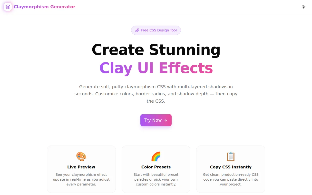
Design ToolsFeatured
Claymorphism Generator
A free CSS claymorphism effect generator with live preview, color presets, multi-layer shadow controls, and one-click CSS copy. Build soft, puffy 3D clay-style UI elements instantly — no login required.
CSSClaymorphismDesign ToolsUI DesignBox ShadowFrontendNext.jsTypeScript
Start Similar ProjectAbout the Project
Claymorphism Generator — Free CSS Clay Effect Tool
Claymorphism Generator is a free, browser-based tool that lets you create CSS claymorphism effects in real time. Pick a color preset or customize your own, tune the shadow layers and border radius, then copy the production-ready CSS with one click. No signup, no install — just open and start designing.
The Problem
Claymorphism looks simple in design mockups but writing the CSS from scratch is tedious. The effect relies on multi-layer box-shadow — a dark drop shadow on one side, a lighter reflected shadow on the other, and an inset highlight at the top. Getting the three layers balanced requires back-and-forth tweaking of six or more numeric values, none of which have obvious visual mappings.
/* What you're writing by hand */
box-shadow:
  8px 8px 20px 0px rgba(201, 67, 67, 0.5),
  -4px -4px 14px 0px rgba(255, 158, 158, 0.8),
  inset 0 2px 10px 0 rgba(255, 255, 255, 0.60);
That's three shadow declarations, six position values, two color values, two opacity values — and still no guarantee it will look like clay until you render it.
How It Works
Live Preview Canvas
The preview canvas shows the clay element updating in real time as you adjust every parameter. The preview renders on a dotted background that makes the layered shadows visible, so you can judge depth accurately before copying anything.
Color Presets
Six built-in presets — Coral, Sky, Mint, Lavender, Sunshine, and Peach — give you production-ready color schemes instantly. Each preset sets all three colors (background, dark shadow, light shadow) as a coordinated group. Tap a preset to apply it, then fine-tune from there.
Shadow Layer Controls
Four sliders control the shadow geometry:
- Offset X / Offset Y — depth and direction of the clay effect
- Blur — softness of the shadow edges
- Spread — how far the shadows extend beyond the element
The tool calculates the counter-shadow (light side) automatically based on the main shadow values, so the result always looks three-dimensional without manual balancing.
Inner Highlight Toggle
The inset glow at the top of a clay element creates the plastic sheen characteristic of the style. Toggle it on or off, and adjust its opacity to dial in exactly how "shiny" the surface feels.
Shape Controls
Border radius, width, height, and padding are all adjustable. The preview updates immediately, so you can match any element size from a small button to a large card.
One-Click CSS Copy
When the effect looks right, copy the complete CSS — including background-color, border-radius, and the full multi-layer box-shadow — with a single click.
Key Features
- Live real-time preview — see the clay effect as you adjust every parameter
- Six coordinated color presets — start fast with production-ready palettes
- Custom color pickers — hex input + native color picker for all three colors
- Multi-layer shadow editor — offset, blur, spread, and inner highlight controls
- Complete CSS output — includes background-color, border-radius, and box-shadow
- One-click copy — clipboard-ready CSS with toast confirmation
- Fully client-side — no API calls, no data leaves your browser
- No login required — open the tool and start generating immediately
Technical Implementation
Core Technologies
- Next.js 16 with App Router
- TypeScript in strict mode
- Tailwind CSS v4 with OKLCH color tokens
- shadcn/ui components (new-york style)
- Framer Motion for section animations
- Sonner for clipboard copy toasts
Architecture
The shadow calculation is fully derived: given a background color, dark shadow color, light shadow color, and four geometry values, the tool computes all three box-shadow layers and renders a complete CSS declaration. There's no state synchronization between preview and output — they're the same computed value.
Color inputs accept both hex text and native <input type="color"> pickers. The text input validates to the /^#[0-9a-fA-F]{0,6}$/ pattern, so partial hex values never break the preview.
Use Cases
Landing Page Hero Sections
Claymorphism is popular for bold hero sections and feature highlights on SaaS landing pages. Generate a card style that matches your brand color, copy the CSS, apply it to your <div>.
Button and CTA Styling
Clay-style buttons are trending in consumer apps. Generate the effect with a border radius that matches your design system, then apply the box-shadow to your button component.
Onboarding UI Cards
Onboarding flows with step cards benefit from the playful, approachable feel of claymorphism. Generate a card style, adjust the shadow depth to your preference, copy and paste.
Design Exploration and Mockups
When exploring visual directions, the generator lets you iterate quickly — try six presets in seconds, tweak shadow depth without touching code, and screenshot the preview for stakeholder review.
Learning CSS Box Shadow
Multi-layer box-shadow is one of CSS's more powerful but cryptic features. The generator makes the relationship between values and visual output tangible — adjust a slider, see the shadow change, understand how each parameter contributes to the final effect.
Why Claymorphism Generator?
vs. Writing CSS by Hand
- Instant visual feedback — see the effect before writing a single line
- Shadow balance is automatic — light counter-shadow calculated from your inputs
- Presets for common palettes — production-ready starting points, not blank slates
vs. General CSS Tools
- Purpose-built for claymorphism — controls mapped specifically to clay effect parameters
- Three-layer shadow made simple — drop, counter-shadow, and inset highlight in one interface
- Brand-matched output — start with your brand color, not a default green
Try it now: claymorphism-generator.tools.jagodana.com
The Challenge
The client needed a robust design tools solution that could scale with their growing user base while maintaining a seamless user experience across all devices.
The Solution
We built a modern application using CSS and Claymorphism, focusing on performance, accessibility, and a delightful user experience.
Project Details
Category
Design Tools
Technologies
CSS,Claymorphism,Design Tools,UI Design,Box Shadow,Frontend,Next.js,TypeScript
Date
July 2026
Related Projects
More work in Design Tools