Back to Projects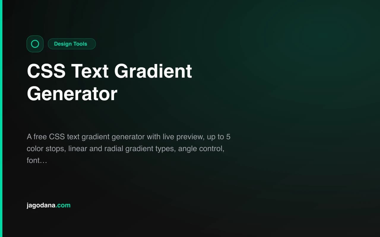
Design ToolsFeatured
CSS Text Gradient Generator
A free CSS text gradient generator with live preview, up to 5 color stops, linear and radial gradient types, angle control, font size and weight options, and one-click CSS copy. Create stunning gradient text effects instantly — no login required.
CSSGradientDesign ToolsTypographyText EffectsFrontendNext.jsTypeScript
Start Similar ProjectAbout the Project
CSS Text Gradient Generator — Free Text Gradient CSS Tool
CSS Text Gradient Generator is a free, browser-based tool that creates production-ready CSS gradient text effects in real time. Pick colors, adjust the gradient angle or type, tune font size and weight, then copy the complete CSS — including the -webkit-background-clip: text trick — with one click. No signup, no install, no backend.
The Problem
CSS gradient text involves a technique that trips up every developer the first time: applying a background gradient to an element and then using -webkit-background-clip: text to reveal it through the text shape. The syntax is non-obvious and browser compatibility requires both the prefixed and unprefixed properties:
.gradient-text {
  background: linear-gradient(135deg, #3b82f6, #a855f7);
  -webkit-background-clip: text;
  -webkit-text-fill-color: transparent;
  background-clip: text;
}
Writing this by hand every time — and tweaking the colors and angle until it looks right without any visual feedback — is the kind of task that should take seconds but routinely takes minutes.
How It Works
Live Preview Canvas
The preview area shows your gradient text updating in real time as you adjust any parameter. The displayed font size and weight match your chosen settings, so what you see in the preview is exactly what you'll get in your project.
You can type custom preview text directly below the gradient — test it with your actual heading, tagline, or button label to make sure it looks right before copying.
Gradient Types
Linear — flows at a configurable angle (0–360°). The angle slider labels the key directions: 0° points right, 90° points down, 180° points left, 270° points up. Diagonal angles like 135° are popular for headings.
Radial — radiates outward from the center of the element. Useful for a spotlight or "glowing center" effect where the brightest color appears in the middle of the text.
Color Stop Controls
Add up to 5 color stops. Each stop has:
- Color picker — click the swatch to open the native OS color picker
- Hex input — type the exact hex value for precision; updates the preview instantly
- Position slider — drag to place the stop anywhere from 0% to 100% along the gradient
Stops are automatically sorted by position when rendering the gradient, so you can add them in any order.
Presets
Six built-in presets give you production-ready starting points:
- Ocean — cyan to blue, clean and professional
- Sunset — orange to pink to purple, warm and vibrant
- Forest — emerald to blue, fresh and tech-forward
- Fire — red to orange to yellow, energetic
- Aurora — full-spectrum green → blue → purple → pink
- Rose Gold — rose to orange, elegant and modern
Click any preset and all color stops update at once. You can then fine-tune from there.
Typography Controls
- Font size — 16px to 120px via slider, updates the preview proportionally
- Font weight — six options from Normal (400) to Black (900); the button labels are rendered at their actual weight so you can visually compare
One-Click CSS Copy
When the gradient looks right, click Copy CSS to get the full snippet on your clipboard:
.gradient-text {
  background: linear-gradient(135deg, #3b82f6 0%, #a855f7 100%);
  -webkit-background-clip: text;
  -webkit-text-fill-color: transparent;
  background-clip: text;
}
The output always includes both the prefixed and unprefixed background-clip for maximum browser support.
Key Features
- Linear & radial gradient types — two distinct visual styles with dedicated controls
- Up to 5 color stops — multi-color gradients like rainbow or sunset text
- Live preview — real-time update on every parameter change
- 6 presets — production-ready palettes to start from
- Angle control — full 0–360° range for linear gradients
- Font size & weight — 16–120px and 6 weight options
- Custom preview text — test with your actual content
- One-click copy — complete CSS with all required properties
- Fully client-side — no API calls, no data leaves your browser
- No login required — open and start generating immediately
Technical Implementation
Core Technologies
- Next.js 16 with App Router
- TypeScript in strict mode
- Tailwind CSS v4 with OKLCH color tokens
- shadcn/ui components (new-york style)
- Framer Motion for entrance animations
- Sonner for clipboard copy toast notifications
Architecture
The gradient computation is a pure function of the current state: given type, stops[], and angle, it produces both the CSS background value for the live preview and the full copyable CSS string. There's no reconciliation between preview and output — they derive from the same inputs.
Color inputs validate against /^#[0-9a-fA-F]{0,6}$/ in real time, so partial hex values never crash the preview. The native <input type="color"> overlays the color swatch and syncs bidirectionally with the text input.
Stop positions are sorted before rendering, so reordering stops by dragging their sliders always produces a valid gradient declaration.
Use Cases
Hero Headings and Marketing Copy
Gradient text is the go-to effect for hero headings on SaaS landing pages, portfolio sites, and product launches. Generate a gradient that matches your brand colors, copy the CSS, apply it to your <h1>.
Navigation and UI Labels
Subtle gradient labels in nav bars or badge chips add visual interest without overwhelming the design. A two-stop blue-to-purple gradient on a small nav item can feel premium without being distracting.
Button Text
For CTA buttons with transparent or outline styles, gradient text makes the label itself the visual accent. Generate the effect, test it with your button label text in the preview, and copy.
Design System Exploration
When building a design system, gradient text tokens are often the last thing documented. The generator lets you iterate across presets quickly, land on a palette, and export the exact values.
Learning CSS Gradient Text
The background-clip: text trick is one of CSS's less intuitive features. The generator makes the relationship between stops, positions, and the final visual tangible — add a stop, move it, and watch the gradient respond.
Why CSS Text Gradient Generator?
vs. Writing CSS by Hand
- Instant visual feedback — no edit-save-reload cycle
- All required properties included — prefixed and unprefixed in a single snippet
- Presets for a faster starting point — six palettes instead of a blank canvas
vs. General Gradient Tools
- Purpose-built for text — output always includes
-webkit-background-clip: textand-webkit-text-fill-color: transparent - Typography controls included — test at the actual font size and weight, not a default preview
- Copy-ready output — one click, not four fields to assemble manually
Try it now: css-text-gradient-generator.tools.jagodana.com
The Challenge
The client needed a robust design tools solution that could scale with their growing user base while maintaining a seamless user experience across all devices.
The Solution
We built a modern application using CSS and Gradient, focusing on performance, accessibility, and a delightful user experience.
Project Details
Category
Design Tools
Technologies
CSS,Gradient,Design Tools,Typography,Text Effects,Frontend,Next.js,TypeScript
Date
August 2026
Related Projects
More work in Design Tools