Back to Projects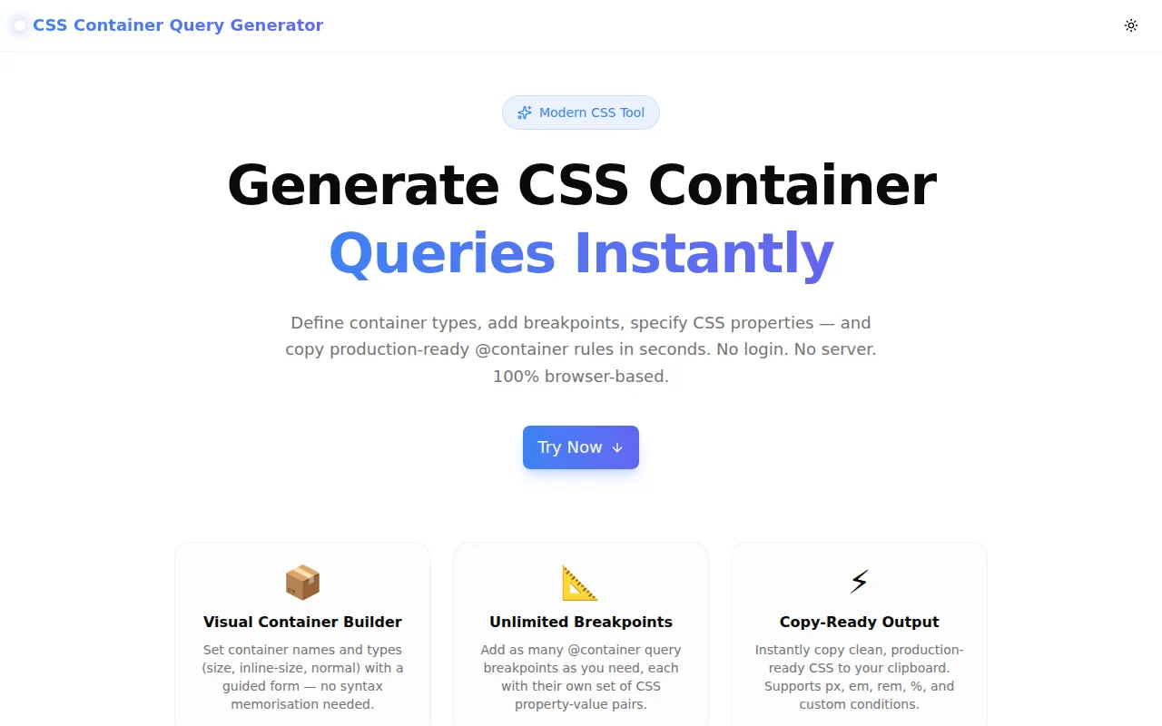
Developer ToolsFeatured
CSS Container Query Generator
A free visual builder for CSS container queries — define container types, add @container breakpoints with CSS property-value pairs, and copy production-ready code instantly. No login required.
CSSContainer QueriesResponsive DesignDeveloper ToolsFrontendNext.jsTypeScript
Start Similar ProjectAbout the Project
CSS Container Query Generator — Build @container Rules Visually
CSS Container Query Generator is a free, browser-based tool that lets you visually construct CSS @container rules — choose the container type, set named containers, add breakpoints with conditions, specify CSS property-value pairs per breakpoint, and copy the production-ready CSS with one click. No signup, no server, no install.
The Problem
CSS container queries are one of the most significant additions to CSS in years. They let UI components respond to the size of their container rather than the viewport — enabling truly reusable, context-aware components.
But the syntax requires knowing several interconnected pieces:
.card {
  container-type: inline-size;
  container-name: card;
}

@container card (min-width: 400px) {
  .card-body {
    display: grid;
    grid-template-columns: repeat(2, 1fr);
  }
}
Remembering when to use inline-size vs size, whether container-name is required, and how to combine named containers with conditions — these are the small friction points that slow adoption of a powerful feature.
How It Works
1. Container Setup
Configure the container element in one panel:
- Container class name — the CSS selector that receives
container-type - container-type — choose
inline-size(width only, lowest overhead),size(width + height), ornormal(no size containment) - container-name — optional; required when you have nested containers and need to target a specific ancestor
The tool generates the container declaration block immediately as you type.
2. Visual @container Rule Builder
Add as many @container query rules as needed. Each rule has:
- Condition type — min-width, max-width, min-height, max-height, or a fully custom condition expression
- Value and unit — enter the breakpoint value with px, em, rem, or % units
- Target selector — the child element to style inside this breakpoint
- CSS properties — unlimited property-value pairs with property name autocomplete for common properties
Rules can be collapsed to keep the interface clean when working with many breakpoints. They can be removed individually.
3. Live CSS Output
The right panel shows the complete generated CSS, updating in real time as you configure. The output is clean, properly indented, and production-ready. Copy to clipboard or download as a .css file.
Key Features
- Visual container builder — set container type and name with a guided form
- Unlimited @container rules — add as many breakpoints as needed
- Multiple condition types — min-width, max-width, min-height, max-height, custom
- Multiple units — px, em, rem, %
- Named container support — target specific ancestors in nested layouts
- CSS property autocomplete — common property suggestions for faster input
- Collapsible rules — keep the UI organised when working with many breakpoints
- Download as .css — save the file directly for use in your project
- One-click copy — clipboard-ready output
- 100% client-side — nothing leaves your browser
- No signup required — open and start generating immediately
Technical Implementation
Core Technologies
- Next.js 16 with App Router
- TypeScript in strict mode
- Tailwind CSS v4 with OKLCH color tokens
- shadcn/ui + Radix UI components
- Framer Motion for panel animations
- Sonner for toast notifications
- Pure client-side rendering — zero external API dependencies
Architecture
- State-driven CSS generation: a pure function converts the container config + rule array into a CSS string on every render
- Rules stored as an array of objects — each with condition, selector, and properties
- Collapsed/expanded state per rule for UI ergonomics
- Datalist element for property name autocomplete without a heavyweight library
- Clipboard API for copy; Blob URL for download
Use Cases
Responsive Card Components
A card component that renders in sidebars (240px wide) and main content areas (800px wide) needs different layouts in both contexts. Container queries let it adapt to its container, not the viewport:
.card {
  container-type: inline-size;
}

@container (min-width: 500px) {
  .card-body {
    display: grid;
    grid-template-columns: 1fr 2fr;
  }
}
Design System Components
A design system's <MediaCard /> component needs to be usable in any context — as a hero, in a grid, in a narrow sidebar. Container queries make this possible without prop drilling or JavaScript layout detection.
Navigation Components
A navigation component that switches from a horizontal tab bar to a vertical list when its container is narrow — without knowing where on the page it's placed.
Learning CSS Container Queries
Container queries are powerful but require understanding containment, the difference between inline-size and size, and when to use named containers. The visual builder makes these relationships concrete: change the container type, see the CSS update, understand the implications.
Browser Support
Container queries are supported in all modern browsers: Chrome 105+, Firefox 110+, Safari 16+, Edge 105+. Safe to use in production today.
For progressive enhancement: @supports (container-type: inline-size) { ... }.
Why CSS Container Query Generator?
vs. Writing by Hand
- No syntax lookup — container-type options are one click away
- No typos in condition syntax — conditions are built from structured inputs
- Named container reference — the tool automatically threads the container name through both the declaration and the @container rule
vs. Other CSS Generators
- Container query specific — built for this feature, not bolted on
- Named container support — most tools don't handle this
- Unlimited rules — not limited to one breakpoint
- Download option — save the CSS file directly
Try it now: container-query-generator.tools.jagodana.com
The Challenge
The client needed a robust developer tools solution that could scale with their growing user base while maintaining a seamless user experience across all devices.
The Solution
We built a modern application using CSS and Container Queries, focusing on performance, accessibility, and a delightful user experience.
Project Details
Category
Developer Tools
Technologies
CSS,Container Queries,Responsive Design,Developer Tools,Frontend,Next.js,TypeScript
Date
May 2026
Related Projects
More work in Developer Tools