Back to Projects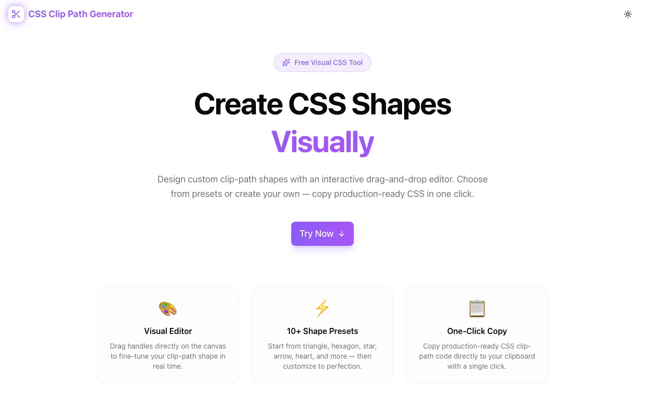
Developer ToolsFeatured
CSS Clip Path Generator
A free visual editor for creating CSS clip-path shapes. Drag handles on an interactive canvas, choose from 15+ presets, switch between polygon, circle, ellipse, and inset modes, and copy production-ready CSS—no signup required.
CSSClip PathDeveloper ToolsFrontendNext.jsTypeScript
Start Similar ProjectAbout the Project
CSS Clip Path Generator — Visual Clip Path Shape Editor
CSS Clip Path Generator is a free, browser-based tool for creating CSS clip-path shapes visually. Drag handles on an interactive canvas, pick from 15+ shape presets, switch between polygon, circle, ellipse, and inset modes, and copy the CSS with one click. No signup, no install—open it and start shaping.
The Problem
CSS clip-path is one of the most powerful layout and design properties in CSS. It lets you clip any element to a custom shape—triangles, hexagons, stars, speech bubbles, diagonal sections, you name it. But writing clip-path values by hand is brutal:
clip-path: polygon(50% 0%, 100% 38%, 82% 100%, 18% 100%, 0% 38%);That's a pentagon. Five coordinate pairs, each as a percentage of the element's bounding box. Without a visual reference, you're plotting points on an invisible grid, saving, refreshing, and hoping the shape resembles what you had in mind.
It gets worse with complex shapes. A star has ten points. An arrow needs precise alignment. A custom badge or decorative section divider might need a dozen coordinates. The mental math required to place each point correctly makes clip-path impractical to write by hand for anything beyond trivial shapes.
How It Works
1. Interactive Drag-and-Drop Canvas
The editor displays your shape on a visual canvas with draggable handles at each point. Move any handle and the shape updates in real time—you see exactly what the CSS will produce as you design it. No save-refresh cycle, no guesswork.
Add or remove points for polygon shapes to increase or decrease complexity. Every adjustment is reflected instantly in the generated CSS below the canvas.
2. Multiple Shape Modes
Not every clip-path is a polygon. The generator supports all four CSS clip-path functions:
- Polygon — the most flexible mode. Define any number of points to create triangles, hexagons, stars, arrows, chevrons, and custom shapes.
- Circle — define a circular clip with adjustable radius and center position.
- Ellipse — like circle, but with independent horizontal and vertical radii for oval shapes.
- Inset — rectangular clipping with optional rounded corners, useful for cropping effects and reveal animations.
Switch between modes and the canvas adapts its controls accordingly.
3. 15+ Shape Presets
Starting from a blank canvas is unnecessary for common shapes. Presets include:
- Triangles — equilateral, right-angle, inverted
- Polygons — pentagon, hexagon, octagon
- Stars — five-point, six-point, burst
- Arrows — left, right, chevron, double-arrow
- Decorative — cross, frame, trapezoid, parallelogram, speech bubble
Click a preset to load its points onto the canvas, then drag handles to customize. It's the fastest path from concept to CSS.
4. One-Click CSS Copy
When the shape looks right, copy the complete clip-path declaration with a single click. The output is production-ready—paste it directly into your stylesheet, component, or CSS-in-JS solution.
Key Features
- Interactive canvas editor — drag handles to shape your clip-path visually
- Four clip-path modes — polygon, circle, ellipse, and inset
- 15+ shape presets — triangles, stars, arrows, hexagons, and more
- Add/remove polygon points — increase or decrease shape complexity
- Real-time preview — shape updates instantly as you drag
- One-click CSS copy — production-ready output
- Fully client-side — no API calls, no data leaves your browser
- No signup required — start creating immediately
- Responsive design — works on desktop and mobile
Technical Implementation
Core Technologies
- Next.js with App Router
- TypeScript in strict mode
- TailwindCSS for styling
- Client-side rendering — zero external API dependencies
Architecture
- SVG-based interactive canvas with draggable point handles
- Real-time CSS generation from point coordinates
- Shape mode system (polygon, circle, ellipse, inset) with mode-specific controls
- Preset library with one-click application and subsequent customization
- Clipboard API integration for copy functionality
- Responsive layout adapting canvas size to viewport
Use Cases
Diagonal Section Dividers
Full-width diagonal dividers between page sections create visual flow and break the horizontal monotony. Instead of SVG backgrounds or pseudo-elements with transforms, a single clip-path: polygon() on the section element produces the exact angle you need—and the generator lets you see and adjust that angle visually.
Hero Section Shapes
Clip an image or background to a custom shape for visual impact. Diagonal cuts, angled edges, or geometric frames make hero sections distinctive without adding markup or using image editing software.
Image Masking and Framing
Clip photos and avatars to hexagons, circles, rounded rectangles, or custom shapes. CSS clip-path is lighter than SVG masks for simple shapes and works on any element—images, videos, divs.
Decorative UI Elements
Stars for ratings, arrows for navigation cues, speech bubbles for testimonials, badges for notifications. Clip-path creates these shapes with pure CSS—no icon fonts, no SVGs, no extra assets to load.
Reveal Animations
Animate clip-path values for creative reveal effects. Start with clip-path: circle(0%) and transition to circle(100%) for a circular reveal. The generator helps you define the start and end states visually.
CSS Art and Experiments
For developers exploring creative CSS, clip-path is a fundamental tool. The generator makes experimentation fast—try a shape, see the result, iterate, copy the CSS.
Why CSS Clip Path Generator?
vs. Manual CSS
- Visual feedback — see the shape as you build it, not after a refresh
- Point-by-point control — drag instead of calculating percentages
- Complex shapes made accessible — stars, arrows, and custom shapes without the math
vs. SVG Clip Paths
- Simpler syntax — one CSS property vs. inline SVG
<clipPath>elements - Easier to animate — CSS transitions work directly on clip-path values
- No extra markup — apply to any element without wrapping in SVG
vs. Other Generators
- Multiple shape modes — not just polygon; supports circle, ellipse, and inset
- Rich preset library — 15+ starting shapes for common needs
- Add/remove points — full control over polygon complexity
- Clean output — production-ready CSS, not a code snippet with comments
Results
CSS Clip Path Generator removes the friction from CSS clip-path:
- Zero coordinate math — drag handles instead of calculating percentages
- Complex shapes accessible — stars, arrows, and custom polygons in seconds
- Faster design iteration — from concept to CSS without the save-refresh loop
- Production-ready output — copy and paste with confidence
Try it now: css-clip-path-generator.tools.jagodana.com
The Challenge
The client needed a robust developer tools solution that could scale with their growing user base while maintaining a seamless user experience across all devices.
The Solution
We built a modern application using CSS and Clip Path, focusing on performance, accessibility, and a delightful user experience.
Project Details
Category
Developer Tools
Technologies
CSS,Clip Path,Developer Tools,Frontend,Next.js,TypeScript
Date
March 2026
Related Projects
More work in Developer Tools

