Color Blindness Simulator: Test Your Designs for All 8 Types of Color Vision Deficiency
Learn what color blindness is, how the 8 types of color vision deficiency affect design perception, and how to use our free Color Blindness Simulator to build accessible products that work for everyone.
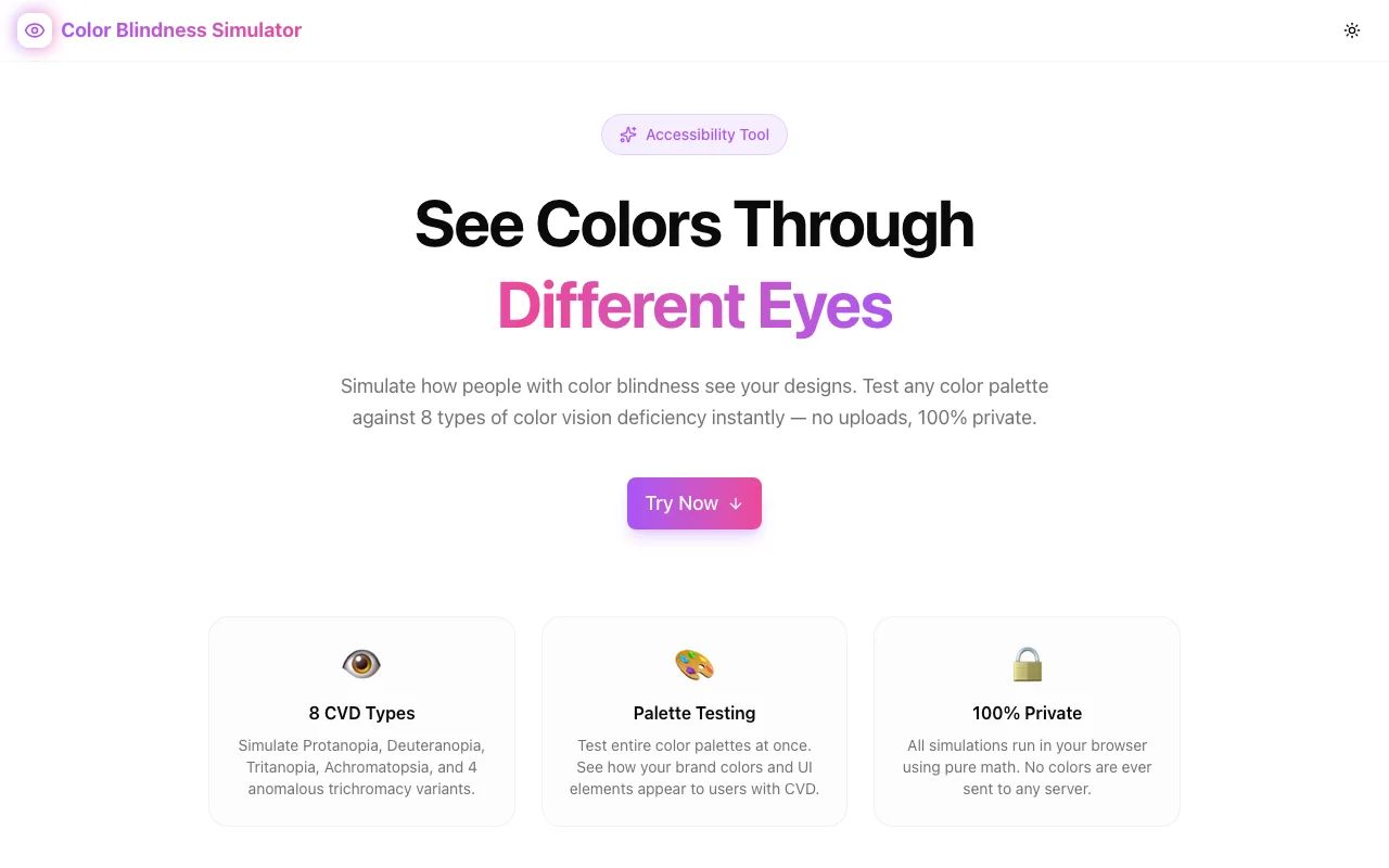
Color Blindness Simulator: Test Your Designs for All 8 Types of Color Vision Deficiency
About 300 million people worldwide experience some form of color vision deficiency. If you're designing a product—an app, a website, a dashboard, a chart—roughly 1 in 12 of your male users and 1 in 200 of your female users see your colors differently than you do.
Not slightly differently. Fundamentally differently. Colors you carefully chose to communicate meaning—red for errors, green for success, blue for links—might be indistinguishable, muted, or invisible to a significant portion of your audience.
We built Color Blindness Simulator to make this problem visible and fixable—before you ship.
What Is Color Blindness?
Color blindness (more accurately called color vision deficiency or CVD) isn't actually blindness. It's the reduced ability to perceive differences between certain colors. Most color vision happens through three types of cone cells in the retina, each sensitive to different wavelengths of light:
- L-cones (long wavelength) — primarily sensitive to red
- M-cones (medium wavelength) — primarily sensitive to green
- S-cones (short wavelength) — primarily sensitive to blue
When one or more cone types are missing or malfunctioning, color perception changes. The specific type of CVD depends on which cones are affected and how severely.
The 8 Types of Color Vision Deficiency
Color Blindness Simulator covers all 8 recognized types. Here's what each one means for your designs:
Red-Green Deficiencies (Most Common)
Protanopia (Red-Blind) — Complete absence of L-cones. Red appears dark, almost black. Red-orange-green distinctions collapse. Affects ~1% of males.
Deuteranopia (Green-Blind) — Complete absence of M-cones. Greens shift toward beige/brown. Red and green become nearly indistinguishable. Affects ~1% of males.
Protanomaly (Red-Weak) — L-cones are present but shifted in sensitivity. Reds appear muted and shifted toward green. Affects ~1% of males.
Deuteranomaly (Green-Weak) — M-cones are present but shifted. The most common form of CVD, affecting ~5% of males. Greens look more red/brown. Subtle color differences are lost.
Blue-Yellow Deficiencies (Rare)
Tritanopia (Blue-Blind) — Complete absence of S-cones. Blues appear green, yellows appear pink/light. Very rare (~0.003% of the population).
Tritanomaly (Blue-Weak) — S-cones are present but reduced in sensitivity. Blues appear greener, yellows appear lighter. Extremely rare.
Complete Color Deficiency (Very Rare)
Achromatopsia (Monochromacy) — No functioning cone cells at all. The world appears in grayscale. Extremely rare (~0.003%).
Achromatomaly — Severely reduced color perception across all cone types. Colors are visible but heavily desaturated. Extremely rare.
Why This Matters for Designers and Developers
Here's the uncomfortable truth: color alone is never a reliable way to communicate information.
Consider these common patterns that break for CVD users:
Status Indicators
A green checkmark for success and a red X for failure. For someone with deuteranopia, both might look brownish-olive. Without labels or icons, the meaning is lost.
Form Validation
Red borders on invalid fields. Someone with protanopia might not notice the border color changed at all—red can appear nearly identical to the default dark gray.
Charts and Graphs
A line chart with 5 colored lines. Under deuteranomaly (affecting 5% of men), two or three of those lines might merge into the same apparent color. Your carefully segmented data becomes unreadable.
Navigation States
Active tab highlighted in green, inactive in gray. For some CVD types, the contrast between these states drops below perceptible thresholds.
Traffic Light Patterns
Red/yellow/green progress indicators. The entire red-green spectrum is problematic for the most common forms of CVD.
How to Use Color Blindness Simulator
Step 1: Enter Your Colors
Pick or paste any color—hex, RGB, or use the color picker. Start with the colors that carry meaning in your design: status colors, chart colors, interactive states, brand palette.
Step 2: Review All 8 Simulations
The tool instantly shows how your color appears under every CVD type. Look for:
- Colors that become identical — two distinct colors that merge under a specific CVD type
- Colors that lose contrast — pairs that become hard to distinguish
- Colors that shift meaning — a "warning yellow" that becomes indistinguishable from a "success green"
Step 3: Compare Your Palette
Use the palette comparison grid to test multiple colors simultaneously. This is where real problems surface—not in individual colors, but in the relationships between them. Two colors that look completely different to you might be nearly identical under deuteranopia.
Step 4: Check WCAG Contrast
Use the built-in WCAG contrast checker to verify that your color combinations meet accessibility standards:
| Level | Normal Text | Large Text | |-------|------------|------------| | AA (minimum) | ≥ 4.5:1 | ≥ 3:1 | | AAA (enhanced) | ≥ 7:1 | ≥ 4.5:1 |
Check contrast not just for your original colors, but for the simulated versions too. A pair that passes WCAG with typical vision might fail after CVD simulation.
Practical Accessibility Tips
Once you've identified problems with the simulator, here's how to fix them:
1. Never Rely on Color Alone
This is the single most important rule. Always pair color with at least one other visual cue:
- Icons — ✓ for success, ✗ for error, ⚠ for warning
- Labels — "Success", "Error", "Pending"
- Patterns — hatching, dots, dashes in charts
- Position — consistent placement for status information
- Shape — different shapes for different data series
2. Use High Contrast Pairs
When you must differentiate by color, choose pairs that maintain contrast across CVD types:
- Blue + Orange works better than Red + Green
- Blue + Yellow is distinguishable across most CVD types
- Dark + Light (luminance contrast) survives even achromatopsia
3. Test Your Full Palette, Not Just Individual Colors
A color that looks accessible in isolation might collide with another color in your palette under certain CVD types. Always test the complete set together.
4. Design for Grayscale First
If your design works in grayscale (achromatopsia simulation), it works for everyone. This doesn't mean your design should be grayscale—just that the core information should survive without color.
5. Follow WCAG Guidelines
The Web Content Accessibility Guidelines provide concrete, testable requirements:
- 1.4.1 Use of Color — Color is not the only visual means of conveying information
- 1.4.3 Contrast (Minimum) — 4.5:1 for normal text, 3:1 for large text
- 1.4.6 Contrast (Enhanced) — 7:1 for normal text, 4.5:1 for large text
- 1.4.11 Non-text Contrast — 3:1 for UI components and graphical objects
6. Document Your Accessible Palette
Create a documented color palette that includes CVD-safe alternatives. When your team reaches for a color, they should know which combinations are safe and which need additional visual cues.
The Math Behind CVD Simulation
For the technically curious: CVD simulation works by transforming colors through matrices that model how each cone type's response changes (or disappears) in different deficiency types.
The most widely used models come from Brettel, Viénot, and Machado. The process:
- Convert to LMS color space — LMS represents the response of the three cone types (Long, Medium, Short)
- Apply the simulation matrix — Each CVD type has a specific transformation matrix that adjusts or zeroes out the affected cone response
- Convert back to RGB — Transform the simulated LMS values back to displayable sRGB
For anomalous trichromacy (the "-anomaly" types), the simulation uses interpolation between normal vision and the full deficiency, controlled by a severity parameter.
Who Should Use This Tool
- UI/UX designers — verify that interfaces work for all users before handoff
- Front-end developers — check color-dependent interactions and states
- Data visualization engineers — ensure charts and graphs are readable by everyone
- Accessibility testers — audit color usage as part of WCAG compliance reviews
- Product managers — understand the accessibility impact of design decisions
- Educators — demonstrate CVD concepts with interactive, visual examples
100% Private and Client-Side
All color processing happens in your browser. No colors are uploaded, no data is stored, no tracking. The tool works offline once loaded. Your design palette stays yours.
Try It Now
Stop guessing how your colors look to 300 million people. See for yourself.
👉 Try Color Blindness Simulator
Free, instant, private. No signup required.
Part of Our Accessibility Tools
Color Blindness Simulator joins our growing suite of free accessibility and developer tools:
- Theme Contrast Checker — WCAG color contrast verification
- Color Palette Explorer — Generate and explore color palettes
- Color Blindness Simulator — CVD simulation for all 8 types
All built with the same principles: accurate, fast, private, and free.
Accessible design isn't an afterthought—it's a design constraint that makes your product better for everyone. Start testing your colors →


