CSS Box Shadow Generator: Create Beautiful Box Shadows Online Free
Free online CSS Box Shadow Generator — build layered box shadows visually with live preview. Control offset, blur, spread, color, opacity, and inset. Copy clean CSS instantly, no login required.
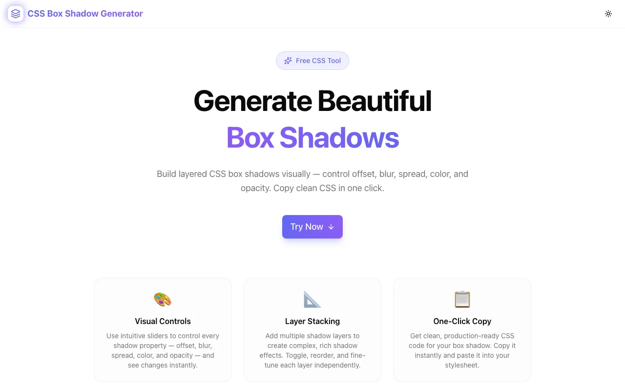
CSS Box Shadow Generator: Create Beautiful Box Shadows Online Free
Writing CSS box-shadow values by hand is one of those things every frontend developer does — and hates. Six parameters, cryptic syntax, and no visual feedback until you reload the browser. The CSS Box Shadow Generator at css-box-shadow-generator.tools.jagodana.com turns that friction into a 30-second task.
Move sliders, see your shadow update live, stack multiple layers, and copy clean CSS. No login, no install, no nonsense.
What Is CSS box-shadow?
The CSS box-shadow property adds a shadow effect to an element's frame. The full syntax is:
box-shadow: [inset] <offset-x> <offset-y> [<blur-radius>] [<spread-radius>] <color>;Each parameter controls a different visual aspect:
| Parameter | What It Does |
|---|---|
| inset | Draws the shadow inside the element instead of outside |
| offset-x | Horizontal shadow position (positive = right, negative = left) |
| offset-y | Vertical shadow position (positive = down, negative = up) |
| blur-radius | Softness of the shadow edge (0 = hard edge) |
| spread-radius | How much the shadow expands or contracts |
| color | Shadow color including alpha (rgba, hex8, or hsla) |
CSS also supports multiple shadows on a single element using comma separation:
box-shadow:
  0 2px 4px rgba(0, 0, 0, 0.1),
  0 8px 24px rgba(0, 0, 0, 0.08);
That's where things get complex to manage manually — and where the generator shines.
Why Use a Box Shadow Generator?
The problem isn't understanding what box-shadow does. It's the iteration speed. Every time you tweak a value, you have to:
- Edit the CSS in your file or DevTools
- Save and reload (or wait for hot reload)
- Inspect the result
- Repeat
For a single-layer shadow, this is annoying. For layered shadows — the kind that make UI elements look truly polished — it's painful. You're essentially debugging a 5+ parameter function by trial and error.
A visual generator collapses that loop to zero. You see the shadow change as you drag the slider. No reload. No guessing.
How to Use the CSS Box Shadow Generator
Step 1: Choose a Preset or Start Fresh
The generator ships with six professional presets:
- Soft Lift — subtle two-layer card shadow
- Material — Material Design elevation shadow
- Hard Shadow — zero-blur brutalist shadow
- Neon Glow — colorful glow effect for dark UIs
- Inner Glow — inset shadow for pressed states
- Floating Card — deep, airy shadow for heavily elevated UI
Click any preset and the controls update instantly. You can then customize from that starting point.
Step 2: Adjust the Controls
Each shadow layer has six controls:
Offset X / Y — drag to position the shadow. A shadow with both offsets at 0 creates a symmetric glow effect. Move X or Y to create directional shadows that simulate a light source.
Blur — at 0, you get a hard-edged shadow. Higher values create softer, more diffuse shadows. Most UI shadows live in the 4–40px range.
Spread — positive spread makes the shadow larger than the element. Negative spread shrinks it. Useful for creating tight inner shadows or oversized glows.
Color + Opacity — pick a hex color with the native color picker, then use the opacity slider for precise alpha control. This is better than editing rgba values by hand.
Inset — toggle to switch between an outer shadow (default) and an inner shadow (inside the element's border).
Step 3: Stack Multiple Layers
Click Add Layer to add a second (or third, or fourth) shadow. Real-world polished shadows almost always use at least two layers:
- A tight, low-opacity shadow for the close "contact" shadow
- A larger, more diffuse shadow for the ambient "elevation" shadow
You can toggle individual layers on or off to compare with and without — or to temporarily hide a layer while you work on another.
Step 4: Preview on Different Backgrounds
Shadows look completely different on light vs. dark backgrounds. Use the background switcher to preview your shadow on:
- Light — white background (browser default)
- Dark — dark background for dark-mode components
- Gradient — mid-tone surface for neutral evaluation
- Checker — checkerboard for evaluating true transparency
Step 5: Copy Your CSS
The output panel shows your box-shadow value as syntax-highlighted CSS. Two formats are available:
/* Single property */
box-shadow: 0 4px 16px rgba(0, 0, 0, 0.12), 0 1px 4px rgba(0, 0, 0, 0.08);

/* Full snippet */
.my-element {
  box-shadow: 0 4px 16px rgba(0, 0, 0, 0.12), 0 1px 4px rgba(0, 0, 0, 0.08);
}
Click Copy CSS and paste it directly into your stylesheet.
CSS Box Shadow Examples
Here are some common shadow patterns and what they look like in CSS:
Soft Card Shadow
A subtle, two-layer shadow that lifts a card off the page without being heavy:
box-shadow:
  0 4px 16px rgba(0, 0, 0, 0.12),
  0 1px 4px rgba(0, 0, 0, 0.08);
Material Design Elevation (Level 4)
Replicates the Material Design 3 elevation shadow:
box-shadow:
  0 2px 4px -1px rgba(0, 0, 0, 0.2),
  0 4px 5px 0 rgba(0, 0, 0, 0.14),
  0 1px 10px 0 rgba(0, 0, 0, 0.12);
Neon Glow (Dark UI)
A colorful glow effect for dark mode interfaces:
box-shadow:
  0 0 20px 4px rgba(99, 102, 241, 0.7),
  0 0 40px 8px rgba(139, 92, 246, 0.4);
Hard Brutalist Shadow
Zero blur, offset shadow for retro/brutalist aesthetics:
box-shadow: 4px 4px 0 0 rgba(0, 0, 0, 1);Inner Glow
Inset shadow for active/pressed states or glassy surfaces:
box-shadow: inset 0 2px 12px 0 rgba(99, 102, 241, 0.3);Floating Card
A large, diffuse shadow for heavily elevated UI elements:
box-shadow:
  0 20px 60px -10px rgba(0, 0, 0, 0.3),
  0 4px 16px 0 rgba(0, 0, 0, 0.1);
CSS Box Shadow Tips & Best Practices
1. Use Multiple Layers for Realism
Real-world shadows have ambient and direct components. Layer a large, low-opacity shadow with a smaller, slightly higher-opacity shadow to create depth that looks physically accurate.
2. Keep Opacity Low for Outer Shadows
Outer shadows typically look best between 8–20% opacity. Anything higher starts to look harsh. Save higher opacity for colored glows or dark-on-dark backgrounds where you need the contrast.
3. Prefer rgba() Over Hex Colors
Even though hex colors are common, using rgba() gives you separate control over color and opacity. The generator handles this automatically by combining your hex color and opacity slider.
4. Negative Spread for Tight Shadows
A spread of -4px to -8px paired with a larger blur radius creates a shadow that stays tight to the element — useful for cards that appear to hover close to their background surface.
5. Always Preview in Dark Mode
If your UI supports dark mode, check your shadows on a dark background. Black shadows become invisible on dark backgrounds — switch to a colored shadow (blue, purple, or white/gray) instead.
6. Match Shadow Direction to Your Light Source
In a UI with a consistent design language, all shadows should use the same X/Y offset direction. Most UIs use a light source from the top-left (positive X, positive Y) or straight above (X: 0, positive Y).
Frequently Asked Questions
Can I use CSS box-shadow on any HTML element?
Yes — box-shadow works on any HTML element, including <div>, <button>, <input>, <img>, and more. For elements with non-rectangular shapes, consider filter: drop-shadow() instead, which follows the shape of the element.
How do I add multiple shadows?
Separate multiple box-shadow values with commas. The generator handles this automatically — every enabled layer becomes a comma-separated entry in the output.
What's the difference between box-shadow and text-shadow?
box-shadow applies to the element's box (its rectangular frame, respecting border-radius). text-shadow applies only to the text content inside an element. For card/button UI shadows, always use box-shadow.
Does box-shadow affect layout?
No — box-shadow doesn't affect the document layout. Unlike outline and border, a box-shadow doesn't take up space. An element's margin/padding doesn't change when you add a shadow.
What browsers support CSS box-shadow?
All modern browsers (Chrome, Firefox, Safari, Edge) fully support box-shadow. Even IE9+ supports it. No vendor prefixes are needed in 2026.
How does inset shadow work?
Adding the inset keyword draws the shadow inside the element's frame rather than outside. Positive Y values push the shadow toward the bottom, but because it's inset, it appears at the top. Useful for pressed states, carved-in effects, and inner glows.
Build Better UI Shadows — Instantly
The CSS Box Shadow Generator is free, works in any browser, requires no login, and stores no data. It's purpose-built for the one thing developers and designers need: see the shadow, copy the code, ship it.
Open it now: css-box-shadow-generator.tools.jagodana.com
Part of the 365 Tools Challenge by Jagodana Studio — one useful developer tool, every day.


