CSS Clip Path Generator: Create Custom CSS Shapes Visually
Free online CSS clip-path generator — drag handles on an interactive canvas, choose from 15+ presets, switch between polygon, circle, ellipse, and inset modes, and copy production-ready CSS instantly.
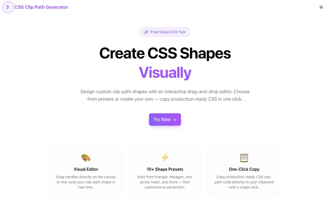
CSS Clip Path Generator: Create Custom CSS Shapes Visually
You want a diagonal section divider on your landing page. Or a hexagonal avatar frame. Or a star-shaped badge. Or an arrow-shaped CTA button. CSS can do all of this with a single property—clip-path—but writing the values by hand means plotting invisible coordinates on an invisible grid:
clip-path: polygon(50% 0%, 61% 35%, 98% 35%, 68% 57%, 79% 91%, 50% 70%, 21% 91%, 32% 57%, 2% 35%, 39% 35%);That's a star. Ten coordinate pairs, each a percentage of the element's width and height. Good luck writing that from scratch, or modifying it to make the star pointer, wider, or asymmetric.
The CSS Clip Path Generator at css-clip-path-generator.tools.jagodana.com turns this into a visual, drag-and-drop experience. Choose a shape, drag the handles, copy the CSS. Done.
What Is CSS Clip-Path?
The clip-path property defines a clipping region for any HTML element. Everything inside the region is visible; everything outside is hidden. It's like cutting a shape out of paper—except the paper is a div, an image, or a video.
CSS supports four clip-path functions:
polygon()
The most versatile. Define a shape with any number of coordinate pairs:
/* Triangle */
clip-path: polygon(50% 0%, 0% 100%, 100% 100%);

/* Hexagon */
clip-path: polygon(25% 0%, 75% 0%, 100% 50%, 75% 100%, 25% 100%, 0% 50%);
Each pair is an X/Y coordinate as a percentage (or length) of the element's bounding box. More points mean more complex shapes—arrows, stars, speech bubbles, custom silhouettes.
circle()
A circular clipping region with a radius and optional center:
/* Circle centered, 50% radius */
clip-path: circle(50% at 50% 50%);

/* Small circle in the top-right */
clip-path: circle(25% at 75% 25%);
ellipse()
Like circle() but with independent horizontal and vertical radii:
clip-path: ellipse(40% 60% at 50% 50%);Useful for oval frames, egg shapes, and subtle asymmetric clipping.
inset()
Rectangular clipping with optional rounded corners:
/* 10% inset on all sides, rounded */
clip-path: inset(10% round 20px);
This is clip-path's answer to border-radius combined with cropping—great for reveal animations and windowed effects.
Why Clip-Path Is Hard to Write by Hand
The coordinate system is the problem. Each point in a polygon() is defined as a percentage of the element's width and height, measured from the top-left corner. For a simple triangle, you can probably visualize three points. But for anything with more than four or five points:
- Stars require precise inner and outer radii at calculated angles
- Arrows need aligned horizontal edges with angled tips
- Custom shapes have no formula—you're plotting points freehand
Every time you change a coordinate, you save the file, switch to the browser, and check whether the shape matches your intention. The feedback loop is slow, and the mental model is fragile. Change one point and the entire shape shifts.
This is why most developers stick to simple shapes or reach for SVG instead. Not because clip-path can't do it, but because writing the values is painful.
How the CSS Clip Path Generator Solves This
Visual Canvas With Draggable Handles
The tool displays your shape on an interactive canvas. Each point appears as a draggable handle. Move a handle and the shape updates in real time—the CSS regenerates below the canvas as you drag. The feedback is immediate: you see exactly what the CSS will produce.
For polygon shapes, you can add new points to increase complexity or remove points to simplify. No need to manually insert coordinate pairs into a string—click where you want a new point and drag it into position.
Shape Mode Selection
Switch between polygon, circle, ellipse, and inset modes. Each mode presents controls specific to that clip-path function:
- Polygon mode shows point handles you can drag, add, and remove
- Circle mode lets you adjust the radius and center position
- Ellipse mode provides separate horizontal and vertical radius controls
- Inset mode controls the inset distances and optional corner rounding
Preset Library
Fifteen-plus preset shapes give you a head start:
- Basic geometry: triangle, pentagon, hexagon, octagon
- Stars and bursts: five-point star, six-point star, starburst
- Arrows and chevrons: left arrow, right arrow, chevron, double-arrow
- Decorative shapes: cross, trapezoid, parallelogram, frame, speech bubble
Click a preset to load it, then customize by dragging handles. This is dramatically faster than building shapes from zero.
Production-Ready Output
The CSS output updates in real time as you edit. When the shape is right, one click copies the full clip-path declaration to your clipboard. Paste it into your stylesheet, Tailwind style prop, CSS module, or wherever you need it—no cleanup required.
Real-World Use Cases
Diagonal and Angled Section Dividers
The most popular clip-path use case. Instead of flat horizontal borders between page sections, use a polygon to create a diagonal edge:
.section-top {
  clip-path: polygon(0 0, 100% 0, 100% 85%, 0 100%);
}
The bottom edge of the section now slopes diagonally. Stack sections with complementary angles and you get a flowing, magazine-style layout. The generator lets you drag the bottom-left and bottom-right points until the angle looks right—no trial and error.
Hero Image Clipping
Rectangular hero images are the default. Clipping the image to a custom shape—a diagonal cut, an angular frame, a soft blob—makes the hero section distinctive. Apply clip-path directly to the <img> element or its container. No Photoshop, no export pipeline.
Avatar and Profile Photo Shapes
Circular avatars are everywhere. Hexagonal avatars, diamond-shaped avatars, or squircle avatars stand out. Apply a clip-path to the image container and you have a unique avatar frame with zero extra markup.
/* Hexagonal avatar */
.avatar {
  clip-path: polygon(25% 0%, 75% 0%, 100% 50%, 75% 100%, 25% 100%, 0% 50%);
}
Animated Reveals and Transitions
CSS clip-path is animatable. Transition between two clip-path values for creative reveal effects:
.element {
  clip-path: circle(0% at 50% 50%);
  transition: clip-path 0.6s ease-out;
}

.element.visible {
  clip-path: circle(100% at 50% 50%);
}
The element expands from a point to full visibility in a circular reveal. Use the generator to define your start and end states—then let CSS transitions handle the animation.
Decorative Backgrounds
Create geometric or organic background shapes for testimonial cards, pricing tables, or feature sections. A clipped div with a gradient background produces decorative elements that would otherwise require SVG or image assets.
Navigation and UI Elements
Arrow-shaped buttons, chevron tabs, ribbon-style badges—all achievable with clip-path. The shapes are pure CSS, so they scale perfectly and don't require additional assets.
Clip-Path vs. SVG Masks vs. Border-Radius
When to Use Clip-Path
- Simple to moderately complex shapes (up to ~15 points)
- Shapes you want to animate with CSS transitions
- Cases where you need the shape to adapt to the element's size
- When you want a single CSS property instead of extra markup
When SVG Masks Are Better
- Highly complex shapes with curves (clip-path polygon only supports straight edges)
- Shapes that need stroke or fill effects
- Reusable shape definitions across multiple elements
When Border-Radius Is Enough
- Rounded rectangles, pills, circles, and organic blobs
- Shapes that only need corner rounding, not arbitrary clipping
Clip-path fills the gap between border-radius (limited to rounding) and SVG masks (powerful but heavy). For geometric shapes with straight edges, clip-path is the sweet spot.
Browser Support
CSS clip-path with polygon(), circle(), ellipse(), and inset() is supported in all modern browsers:
- Chrome 55+
- Firefox 54+
- Safari 13.1+
- Edge 79+
That covers over 97% of global browser usage. For the rare legacy browser that doesn't support it, the element simply renders unclipped—a graceful fallback.
Technical Details
The CSS Clip Path Generator is built with:
- Next.js and TypeScript for type-safe, fast rendering
- TailwindCSS for styling
- Fully client-side — all computation happens in your browser
- No API calls — your shapes stay local
- No account required — open, use, copy, close
The canvas uses the browser's native rendering, so the preview matches production output exactly.
Try It Now
Stop calculating clip-path coordinates by hand. Stop the save-refresh-adjust cycle. Design the shape visually, copy the CSS, and move on.
👉 css-clip-path-generator.tools.jagodana.com
Choose a preset, drag the handles, copy the CSS. It takes seconds.
CSS Clip Path Generator is part of the 365 Tools Challenge—a new free developer tool every day from Jagodana Studio.


