CSS Flexbox Playground: Build Flex Layouts Visually, Copy Clean CSS Instantly
Free online CSS Flexbox playground with real-time preview, container and item controls, preset layouts, and one-click CSS copy. No signup required.
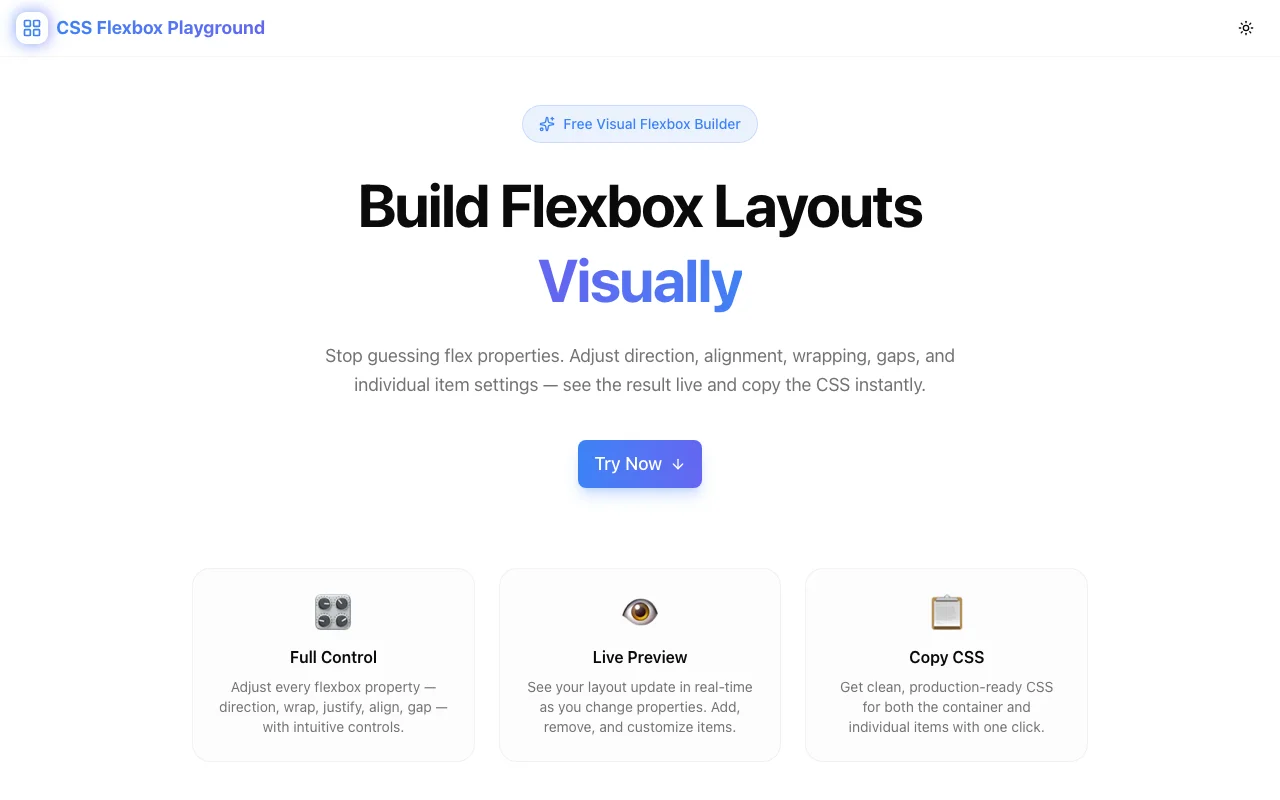
CSS Flexbox Playground: Build Flex Layouts Visually, Copy Clean CSS Instantly
You need a card row that wraps on mobile. Or a navigation bar with the logo on the left and links on the right, vertically centered. Or a sidebar that stays fixed-width while the content area grows to fill the remaining space.
You know Flexbox can handle all of this. What you don't want to do is write justify-content: space-between, save, switch to the browser, realize the items aren't wrapping correctly, add flex-wrap: wrap, save again, realize the alignment is off, and repeat until the layout looks right.
The CSS Flexbox Playground at css-flexbox-playground.tools.jagodana.com short-circuits that cycle. Adjust container and item properties visually, see the layout respond in real time, and copy production-ready CSS the moment it looks right.
Why Flexbox Deserves a Visual Tool
CSS Grid got the CSS Grid Generator. Flexbox—which is used in more web UI than Grid—had nothing equivalent. That gap is worth closing.
Flexbox Is the Default Layout Primitive
Navigation bars, card rows, sidebars, button groups, centered content—these are flex layouts. Flexbox isn't the advanced option; it's the baseline. When you reach for a utility CSS class like flex items-center justify-between, you're describing a flex container. Understanding what that actually means in CSS lets you control it precisely instead of guessing which utility combination produces the right result.
The Property Interactions Are Non-Obvious
Flexbox has a small number of container properties, but they interact in ways that aren't always intuitive. align-items and align-content are both about cross-axis alignment but behave differently depending on whether items wrap. flex-grow: 1 on one item doesn't mean it takes 100% of the space—it means it takes all the remaining space. flex-basis interacts with flex-grow and flex-shrink in ways that even experienced developers sometimes get wrong.
A visual tool makes these interactions observable. Change a property. See what happens. Build the mental model that sticks.
Item-Level Properties Are Underused
align-self, order, flex-grow, and flex-shrink are per-item overrides that give you precise control over individual elements in a flex container. Most developers use flex-grow: 1 on everything and call it done. Having item-level controls in the interface surfaces these properties and makes them accessible.
What's in the Playground
Container Controls
All flex container properties are exposed as segmented buttons or sliders—no value memorization required:
flex-direction— row, row-reverse, column, column-reverseflex-wrap— nowrap, wrap, wrap-reversejustify-content— flex-start, flex-end, center, space-between, space-around, space-evenlyalign-items— flex-start, flex-end, center, baseline, stretchalign-content— all six values for multi-line containersgap— row-gap and column-gap with pixel-level precision
Segmented buttons show every valid value at a glance. No dropdown to open, no value to remember—just click what you want.
Per-Item Editing
Click any flex item to open its individual property controls:
flex-grow— how much the item claims from available spaceflex-shrink— how aggressively the item shrinks when space is tightflex-basis— the starting size before grow/shrink kicks inalign-self— overridealign-itemsfor this item onlyorder— reorder visually without touching HTML
Add up to 12 items to the canvas. Each one is independently configurable.
Preset Layouts
Five common layouts to start from:
| Preset | Use case | |--------|----------| | Centered | Hero sections, modal content, empty states | | Navigation bar | Header with logo + nav links | | Card row | Product grids, feature rows | | Sidebar layout | App shell with fixed panel | | Stack | Vertical lists, form layouts |
Select a preset and customize from there. Most real-world layouts are two or three property changes away from one of these patterns.
Live CSS Output
The generated CSS panel updates in real time. It shows the complete flex container rules plus any per-item overrides:
.container {
  display: flex;
  flex-direction: row;
  flex-wrap: wrap;
  justify-content: space-between;
  align-items: center;
  gap: 16px;
}

.item-3 {
  flex-grow: 2;
  align-self: flex-start;
}
No framework utilities. No shorthand that collapses properties you can't read. Valid CSS you can drop directly into your stylesheet.
Copy the whole thing with one click.
Common Layouts You Can Build in Under a Minute
Navigation Bar
What you need: Logo left, nav links right, everything centered vertically.
flex-direction: row
justify-content: space-between
align-items: center
Three properties. The playground shows you the result before you write a line of code.
Responsive Card Grid
What you need: Cards that sit in a row on desktop and wrap to single-column on mobile.
flex-direction: row
flex-wrap: wrap
gap: 24px
Add flex-basis: 280px and flex-grow: 1 to each card item. The grid fills available space and wraps when there's no room.
Sidebar Layout
What you need: Fixed-width sidebar, content area fills the rest.
flex-direction: row
Sidebar item: flex-basis: 280px; flex-shrink: 0
Content item: flex-grow: 1
That's it. Content fills the available space. Sidebar stays at 280px.
Centered Content
What you need: A single item centered both horizontally and vertically.
justify-content: center
align-items: center
Classic full-viewport centering—the layout problem every developer solves a dozen times and looks up every time. Now you just click it.
Equal-Height Card Row
What you need: Cards that all stretch to the same height regardless of content.
align-items: stretch (this is the default)
Flexbox stretches items to fill the cross-axis by default. The playground makes this visible: add cards with different amounts of text and watch them equalize.
Learning Flexbox With the Playground
If you're newer to Flexbox, the playground is a better learning environment than documentation.
Understand flex-grow vs. flex-basis
Add three items with default settings. Set flex-grow: 1 on all three—they divide available space equally. Now set flex-grow: 2 on the middle item. It claims twice as much of the remaining space as its siblings.
Now change flex-basis on one item. Notice that flex-basis sets the starting size before growth is calculated—it's not the same as width. This distinction is hard to explain with text. It's obvious the moment you see it.
See Why Order of Properties Matters
Toggle align-items while flex-direction: column is active. The cross axis flips. Properties that seem familiar suddenly behave differently. The playground makes the axis orientation concrete.
Explore align-content vs. align-items
Set flex-wrap: wrap and add enough items to force wrapping. Now toggle between align-items and align-content. They control different things: align-items aligns items within each line; align-content aligns the lines themselves. Without multi-line wrapping, align-content does nothing—which is confusing when you're reading documentation. With the playground, you see it.
Privacy and Performance
Everything runs in your browser. No layout data is sent to any server. There's no account system, no analytics on your designs, no tracking. The tool is a static Next.js application that loads quickly and runs offline once cached.
Open the URL. Design your layout. Copy the CSS. Close the tab. Nothing persists anywhere except what you paste into your project.
Try It Now
Stop debugging flex containers by trial and error. Design your next layout visually and copy valid CSS in one click.
👉 css-flexbox-playground.tools.jagodana.com
CSS Flexbox Playground is part of the 365 Tools Challenge—a new free developer tool every day from Jagodana Studio.


