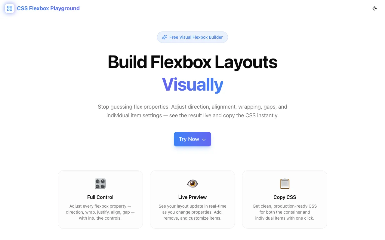
CSS Scroll Snap Generator: Build Scroll Snap Layouts Visually, Copy Clean CSS Instantly
Free online CSS scroll snap generator with live scrollable preview. Configure scroll-snap-type, scroll-snap-align, snap-stop, scroll-padding, and scroll-margin — copy production-ready CSS in one click. No signup required.

CSS Scroll Snap Generator: Build Scroll Snap Layouts Visually, Copy Clean CSS Instantly
You need a horizontal card carousel that snaps center-to-center. Or a full-page vertical scroll where each section fills the viewport. Or a gallery where items always snap to the left edge.
You know CSS scroll snap can handle all of this. What you don't want to do is write the properties from memory, save, switch to the browser, scroll, realize nothing is snapping correctly, open DevTools, adjust one value, save again, and repeat until the behaviour matches what you imagined.
The CSS Scroll Snap Generator at css-scroll-snap-generator.tools.jagodana.com short-circuits that cycle. Configure scroll snap properties visually, scroll a live preview directly inside the tool, and copy production-ready CSS the moment it feels right.
What Is CSS Scroll Snap?
CSS scroll snap is a set of native browser properties that control where a scroll container stops after the user finishes scrolling. Without snap, scroll momentum carries the container to a physics-based stopping point — which might be mid-item, halfway between two cards, or somewhere visually awkward.
With scroll snap, the browser snaps the final resting position to one of a defined set of snap points. You get precise, polished scroll experiences — carousels, full-page sections, image galleries — without any JavaScript.
The Core Properties
There are five CSS properties involved in a scroll snap layout:
| Property | Applies to | What it does |
|----------|-----------|-------------|
| scroll-snap-type | Container | Enables snapping and sets axis + strictness |
| scroll-snap-align | Children | Where each child aligns within the viewport |
| scroll-snap-stop | Children | Whether scroll can skip over a snap point |
| scroll-padding | Container | Offset between the snap point and the container edge |
| scroll-margin | Children | Per-item offset from the snap point |
The challenge is that scroll-snap-type goes on the container and everything else goes on the children — and getting the axis, strictness, and alignment combination right requires experimentation.
Why Does CSS Scroll Snap Feel Confusing?
mandatory vs. proximity Is Non-Obvious
scroll-snap-type: x mandatory forces the browser to snap to the nearest snap point after every scroll — even if the user barely flicked. scroll-snap-type: x proximity only snaps if the scroll position lands close to a snap point; if not, it stays where it stopped.
Mandatory feels "sticky" — great for paginated carousels. Proximity feels more natural — better for long lists where you want occasional snapping but not to force the user to stop at every item.
You cannot understand this difference from documentation alone. You have to feel it.
Container vs. Child Properties Cause Bugs
A common mistake is putting scroll-snap-align on the container instead of the children, or forgetting to set overflow on the container. The browser silently ignores misplaced properties — no error, no warning, just no snapping.
The generator separates container CSS and child CSS into two distinct code blocks. It's impossible to accidentally mix them up.
scroll-padding and scroll-margin Are Easily Forgotten
If you have a sticky navigation bar 64px tall, your snapped content will appear 64px behind it unless you add scroll-padding-top: 64px to the container. Most developers discover this only after shipping and noticing the visual overlap.
scroll-margin is similar but per-item — useful when individual items need a different offset from the snap point.
How the CSS Scroll Snap Generator Works
Step 1: Choose a Scroll Axis
Select Horizontal (x), Vertical (y), or Both to set the axis for scroll-snap-type. The live preview switches between a horizontal row of cards and a vertical stack of panels.
Step 2: Set Snap Strictness
Choose Mandatory or Proximity. The live preview responds immediately — scroll inside it and feel the difference. Mandatory always snaps. Proximity only snaps when you're close enough.
Step 3: Configure snap-align
Select how each child aligns when it snaps:
- Start — the child's leading edge aligns with the container's leading edge
- Center — the child is centered within the visible scroll area
- End — the child's trailing edge aligns with the container's trailing edge
- None — this child is not a snap point
For most carousels, center produces the most balanced look. For paginated sections, start is typical.
Step 4: Toggle snap-stop
Set snap-stop to always to prevent the browser from skipping snap points during a fast scroll. This is useful for step-by-step experiences (onboarding flows, image-by-image galleries) where you don't want the user to skip ahead.
Step 5: Adjust scroll-padding & scroll-margin
Use the steppers to add offset values. If you have a fixed header, set scroll-padding to match its height. If individual items need a specific offset, use scroll-margin.
Step 6: Scroll the Live Preview
A real scrollable container is built inside the tool using your exact configuration. Scroll it. Does it snap where you expect? Does mandatory feel too aggressive? Does the alignment look right at different item sizes?
Step 7: Copy the CSS
The Copy All CSS button copies both the container block and the child block. Or copy them individually from their own code panels. Paste directly into your stylesheet.
Common Scroll Snap Layouts
Horizontal Card Carousel
The most common use case. Cards snap center-to-center as the user swipes left or right.
.snap-container {
  overflow-x: scroll;
  scroll-snap-type: x mandatory;
  display: flex;
}

.snap-child {
  scroll-snap-align: center;
  flex-shrink: 0;
}
Full-Page Vertical Sections
Each section fills the viewport. The page snaps section-to-section on scroll.
.snap-container {
  overflow-y: scroll;
  scroll-snap-type: y mandatory;
  display: flex;
  flex-direction: column;
}

.snap-child {
  scroll-snap-align: start;
  scroll-snap-stop: always;
  flex-shrink: 0;
}
Horizontal Gallery with Header Offset
A photo gallery with a 64px sticky header. scroll-padding prevents images from appearing behind the nav.
.snap-container {
  overflow-x: scroll;
  scroll-snap-type: x mandatory;
  scroll-padding: 64px;
  display: flex;
}

.snap-child {
  scroll-snap-align: start;
  flex-shrink: 0;
}
Frequently Asked Questions
Does CSS scroll snap work on mobile?
Yes. CSS scroll snap has excellent browser support across all modern browsers, including Safari on iOS and Chrome on Android. It is often used specifically for mobile-first carousel and full-screen scroll experiences.
What is the difference between scroll-padding and scroll-margin?
scroll-padding is set on the container and applies to all snap points within it. Think of it as shrinking the effective scroll area. scroll-margin is set on individual children and adjusts the snap point for that specific item. They serve similar purposes but at different levels of specificity.
Should I use mandatory or proximity?
Use mandatory for paginated interfaces where you always want to land on a complete item — carousels, step-by-step flows, image galleries. Use proximity for longer content where snapping should assist but not force — long lists, scroll-driven animations, content feeds.
Can I use scroll snap with overflow: hidden?
No. The scroll container must have overflow-x: scroll (for horizontal), overflow-y: scroll (for vertical), or overflow: scroll (for both). overflow: hidden removes the scrollbar but also removes scrollability, which breaks snapping. overflow: auto works but only creates a scrollbar when content overflows.
Is scroll snap accessible?
Yes, but with caveats. Mandatory snap can make it harder for keyboard users to scroll by small amounts, since every scroll action will jump to the nearest snap point. Consider proximity for contexts where keyboard navigation is important, or ensure your snap items are not so large that they prevent precise navigation.
Privacy and Performance
The CSS Scroll Snap Generator runs entirely in your browser. No configuration data is sent to any server. The tool is a static Next.js application — it loads fast, works offline once cached, and leaves no trace of your session.
Open it. Configure your layout. Copy the CSS. Close the tab.
Try It Now
Stop debugging scroll snap by trial and error. Build your next scroll layout visually and copy valid CSS in one click.
css-scroll-snap-generator.tools.jagodana.com
CSS Scroll Snap Generator is part of the 365 Tools Challenge — a new free developer tool every day from Jagodana Studio.