Claymorphism Generator: Create CSS Clay Effects Instantly
Free online CSS claymorphism generator — pick a color preset, tune multi-layer box shadows and border radius, and copy production-ready CSS in seconds. No login required.
Claymorphism Generator: Create CSS Clay Effects Instantly
There's a reason claymorphism shows up on every hot-takes-in-UI-design list. It's warm, tactile, and impossible to ignore — elements that look like soft inflated clay objects sitting on a flat surface, casting layered shadows.
Writing the CSS to achieve it is a different experience.
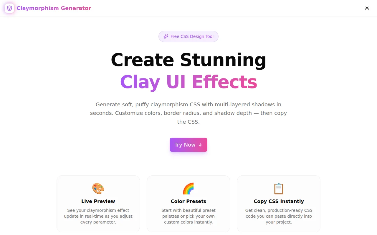
The Claymorphism Generator at claymorphism-generator.tools.jagodana.com turns a multi-value shadow problem into a slider-and-picker workflow: pick a preset, tune the effect, copy the CSS.
What Is Claymorphism in CSS?
Claymorphism is a UI design style that makes interface elements look like soft, puffy 3D clay objects. The characteristic look comes from three things working together:
- Bright, saturated background colors — coral, sky blue, mint, lavender
- Large border radius — usually 20–40px to eliminate hard corners
- Multi-layer box-shadow — a dark drop shadow on one side, a lighter reflected highlight on the opposite side, and an optional inset glow at the top
The CSS result looks like this:
.clay-element {
  background-color: #FF6B6B;
  border-radius: 28px;
  box-shadow:
    8px 8px 20px 0px rgba(201, 67, 67, 0.5),
    -4px -4px 14px 0px rgba(255, 158, 158, 0.8),
    inset 0 2px 10px 0 rgba(255, 255, 255, 0.60);
}
Three shadow declarations, precise color relationships between the background and shadow values, and the inset glow opacity tuned so it reads as "shiny" not "washed out." That's a lot of manual balancing to get right.
How Is Claymorphism Different from Neumorphism?
Both styles use CSS box-shadow for a 3D effect, but they're visually distinct:
| | Neumorphism | Claymorphism | |---|---|---| | Colors | Muted, near-background | Bright, saturated | | Shadows | Subtle, extruded from background | Bold, multi-layered | | Feel | Soft-extruded, flat | Inflated, 3D clay | | Use cases | Dashboards, controls | Landing pages, hero sections |
Neumorphism blends into the background — elements look pressed into or extruded from the page. Claymorphism makes elements pop off the surface like plastic clay objects.
Why Does Claymorphism CSS Take So Long to Write?
The problem is that the three shadow layers aren't independent — they're related to each other and to the background color:
- The dark shadow color should be a deeper, more saturated version of the background
- The light shadow color should be a lighter, washed-out version of the background
- The inset glow is always white at varying opacity
When you change the background color, all three shadow colors need updating. When you change the shadow depth, both the dark and light layer offsets need adjusting (typically the light layer is about half the dark layer's offset).
Getting this balanced manually means cycling between CSS values and browser previews. For a designer prototyping five color options, that's a lot of friction.
What Does the Claymorphism Generator Do?
The generator handles the shadow relationships automatically:
- Set a background color — via hex input or native color picker
- The dark and light shadow colors default to coordinated values for that background
- Adjust shadow offset, blur, and spread with sliders
- The light counter-shadow updates proportionally
- Copy the complete CSS when the effect looks right
Or start from a preset. The six built-in presets — Coral, Sky, Mint, Lavender, Sunshine, Peach — each set all three colors as a balanced group. Start there, adjust one slider, copy.
How Do I Create a Claymorphism Effect Without the Generator?
If you want to write the CSS yourself, here's the formula:
.clay-element {
  /* 1. Bright background color */
  background-color: YOUR_BASE_COLOR;

  /* 2. Large border radius */
  border-radius: 24px; /* adjust to taste, 20–40px common */

  /* 3. Three box-shadow layers */
  box-shadow:
    /* Dark shadow: bottom-right, 50% opacity */
    8px 8px 20px rgba(DARKER_VERSION, 0.5),
    /* Light shadow: top-left, ~half offset, 80% opacity */
    -4px -4px 14px rgba(LIGHTER_VERSION, 0.8),
    /* Inset white glow: top highlight, subtle */
    inset 0 2px 10px rgba(255, 255, 255, 0.6);
}
The tricky parts are choosing DARKER_VERSION and LIGHTER_VERSION. A practical shortcut: use a color tool to desaturate and darken for the dark shadow, and desaturate and lighten for the light shadow. The generator does this calculation automatically.
Which Design Trends Use Claymorphism?
Claymorphism appears most often in:
- Consumer app marketing pages — the tactile feel resonates with broad audiences
- Mobile app UI — large touch targets, bright colors, playful interaction
- SaaS onboarding flows — step cards with clay styling feel approachable, not corporate
- Children's and education products — the clay aesthetic matches playful product personalities
- Dashboards with personality — contrast to flat utility UI
It's less common in enterprise and developer tooling where flat, minimal UI dominates. But used selectively — a hero card, a CTA button, a feature highlight — claymorphism adds dimension without overwhelming a professional design system.
Can I Use Claymorphism for Buttons and Interactive Elements?
Yes, and it works well. For interactive states, extend the CSS with hover and active modifiers:
.clay-button {
  background-color: #FF6B6B;
  border-radius: 28px;
  box-shadow:
    8px 8px 20px rgba(201, 67, 67, 0.5),
    -4px -4px 14px rgba(255, 158, 158, 0.8),
    inset 0 2px 10px rgba(255, 255, 255, 0.60);
  transition: box-shadow 0.15s ease, transform 0.1s ease;
  cursor: pointer;
}

.clay-button:hover {
  box-shadow:
    10px 10px 24px rgba(201, 67, 67, 0.55),
    -5px -5px 16px rgba(255, 158, 158, 0.85),
    inset 0 2px 10px rgba(255, 255, 255, 0.65);
}

.clay-button:active {
  transform: translateY(2px);
  box-shadow:
    4px 4px 12px rgba(201, 67, 67, 0.4),
    -2px -2px 8px rgba(255, 158, 158, 0.6),
    inset 0 1px 6px rgba(255, 255, 255, 0.5);
}
The active state compresses the shadow and adds a slight Y translation to simulate pressing the clay down — a satisfying tactile effect.
Is Claymorphism Accessible?
The design style itself doesn't create accessibility barriers. The key is ensuring sufficient color contrast between text and the bright background colors that claymorphism uses. Because the base colors tend to be mid-range saturation (not dark), text contrast can be an issue:
- White text on coral (#FF6B6B) — approximately 3.5:1 contrast ratio. Passes AA for large text, but marginal for body text.
- Dark text (#1a1a1a) on coral — approximately 7:1 contrast ratio. Passes AAA.
Use the color-contrast-checker.tools.jagodana.com to verify contrast before shipping.
How to Use the Claymorphism Generator
- Open claymorphism-generator.tools.jagodana.com
- Pick a preset — Coral, Sky, Mint, Lavender, Sunshine, or Peach
- Adjust the shadow — offset, blur, spread sliders in the Controls panel
- Fine-tune colors — hex input or color picker for background, dark shadow, light shadow
- Toggle inner highlight — on for plastic sheen, off for matte clay
- Adjust shape — border radius, width, height, and padding
- Copy CSS — click the button in the preview panel or the controls panel
The CSS output is complete: background-color, border-radius, and the full multi-layer box-shadow. Paste it directly into your stylesheet or CSS-in-JS.
Generate your clay CSS now: claymorphism-generator.tools.jagodana.com