CSS Backdrop Filter Generator: Create Frosted Glass Effects in Seconds
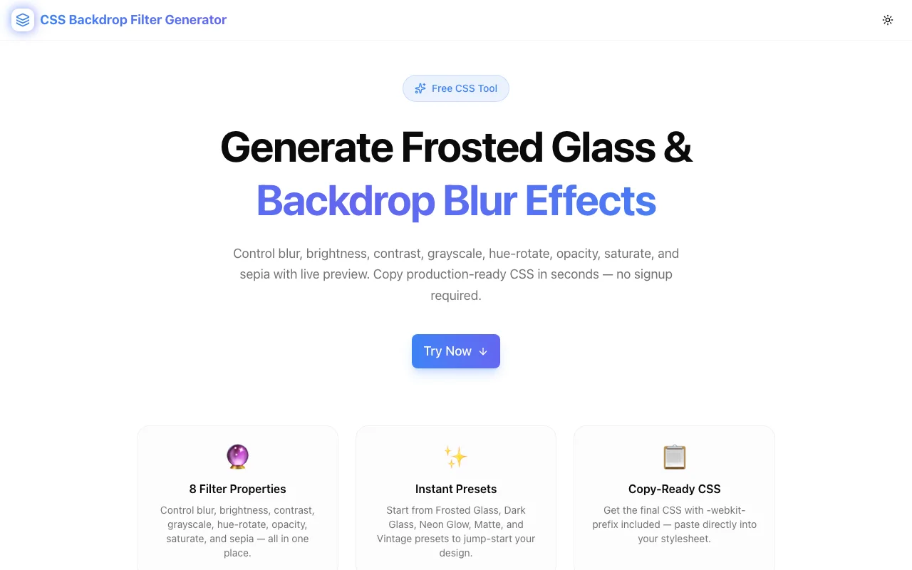
Free online CSS backdrop-filter generator — adjust blur, brightness, contrast, and 6 more properties with live preview. Copy production-ready CSS with -webkit- prefix included. No signup.
CSS Backdrop Filter Generator: Create Frosted Glass Effects in Seconds
You want a frosted glass card. The design tool shows a blurred, translucent panel that subtly reveals the gradient behind it. Translating that into CSS means one property: backdrop-filter.
But backdrop-filter has eight functions — blur, brightness, contrast, grayscale, hue-rotate, invert, opacity, saturate, and sepia. Writing values, saving, refreshing, comparing is the slow path. The CSS Backdrop Filter Generator at css-backdrop-filter-generator.tools.jagodana.com replaces that loop with a live preview and a copy button.
Built in approximately 45 minutes. Here is how it works and when to reach for it.
What is CSS backdrop-filter?
CSS backdrop-filter applies graphical effects to the area behind an element, not to the element itself. This is what makes frosted glass possible: the element's background is semi-transparent, and the browser blurs whatever is behind the element before compositing it.
.frosted-card {
  backdrop-filter: blur(12px);
  -webkit-backdrop-filter: blur(12px); /* Safari */
  background: rgba(255, 255, 255, 0.15);
}
The key distinction: filter applies to the element and its contents. backdrop-filter applies only to what is visible through the element's transparent areas.
What filters does CSS backdrop-filter support?
backdrop-filter accepts the same functions as filter, but applied to the background:
- blur(px) — Gaussian blur, in pixels. The most-used value for frosted glass.
- brightness(%) — Lightens or darkens the backdrop. Default is 100%.
- contrast(%) — Increases or decreases contrast. Default is 100%.
- grayscale(%) — Desaturates the backdrop. 100% is fully grayscale.
- hue-rotate(deg) — Shifts hue on the color wheel. 0° to 360°.
- invert(%) — Inverts backdrop colors. 100% is a full inversion.
- opacity(%) — Transparency of the backdrop effect. Distinct from the element's opacity.
- saturate(%) — Boosts or reduces color saturation. Values above 100% over-saturate.
- sepia(%) — Applies a warm brownish tone. 100% is full sepia.
Multiple functions can be chained:
backdrop-filter: blur(12px) brightness(105%) contrast(95%);How does the Frosted Glass preset work?
The Frosted Glass preset sets: blur 12px, brightness 100%, contrast 100%, all other properties at their defaults.
The blur value of 12px produces visible glass without completely obscuring the background. 4–8px gives a subtle depth hint. 20px+ creates a strong blur that reduces the background to abstract color shapes.
The background color matters as much as the blur. For the glass effect to show, the element needs a semi-transparent background — something like rgba(255, 255, 255, 0.15) for light glass or rgba(0, 0, 0, 0.2) for dark glass. A fully opaque background hides the effect entirely.
Why does Safari require -webkit-backdrop-filter?
Safari implemented backdrop-filter with the -webkit- vendor prefix first, in Safari 9 (2015). The unprefixed version landed in Safari 18 (2024). To support Safari versions 9 through 17 — a nine-year window — both declarations are needed:
backdrop-filter: blur(12px);
-webkit-backdrop-filter: blur(12px);
The CSS Backdrop Filter Generator always includes both. The value on both lines is identical. Skipping -webkit-backdrop-filter is the single most common reason frosted glass works in Chrome but silently fails in Safari.
When should I use backdrop-filter instead of a box-shadow or gradient overlay?
Use backdrop-filter when you want the element to feel like glass: a material that exists in space and interacts with the content behind it.
Use box-shadow when you want depth cues without transparency.
Use a gradient overlay when you want to tint or dim a section of the page but do not need blur.
The use cases where backdrop-filter outperforms the alternatives:
- Sticky navigation bars — blur the page content scrolling behind the header; creates clear separation without covering content with an opaque background
- Modals and dialogs —
backdrop-filter: blur(4px)on the overlay visually separates the modal from the page, indicating depth - Dashboard cards over gradient backgrounds — keeps the background visible through the card while making text readable
- Mobile bottom sheets — frosted glass matches the native mobile look on iOS and modern Android
Is backdrop-filter supported in all browsers?
Current support covers Chrome 76+, Firefox 103+, Edge 79+, and Safari 9+ (with -webkit-prefix). Global browser coverage is approximately 96%.
Firefox versions before 103 require enabling the flag layout.css.backdrop-filter.enabled in about:config. This is rarely encountered in production user bases.
For the remaining 4%, the frosted element simply renders without the backdrop blur — the text and content remain readable, and the element's background color becomes the fallback. This is acceptable degradation for most UI contexts.
How do I make text readable over a blurred backdrop?
The common failure mode: the background behind the card is very colorful, and the blurred colors bleed through and make text unreadable.
Three adjustments solve this:
- Increase the background opacity — move from
rgba(255,255,255,0.1)torgba(255,255,255,0.3). More opaque backgrounds reduce the visual noise from the backdrop. - Raise the brightness — set
backdrop-filter: blur(12px) brightness(120%). A brighter backdrop provides better contrast against dark text. - Add contrast —
contrast(110%)pushes the backdrop colors further apart, which often makes dark text stand out more.
The CSS Backdrop Filter Generator lets you adjust brightness and contrast alongside blur in real time, so you can find the readable combination visually without trial-and-error in a code editor.
What is the difference between filter and backdrop-filter?
Both properties accept the same function set. The difference is what they target:
| Property | Target |
|---|---|
| filter | The element itself and all its children |
| backdrop-filter | The area visible through the element's transparent pixels |
Practical consequence: filter: blur(12px) makes the element's own text blurry. backdrop-filter: blur(12px) keeps the element's text sharp and blurs only what is behind the element.
For frosted glass, always use backdrop-filter.
How to use the generated CSS
- Open the generator and pick a preset (Frosted Glass is a reliable starting point).
- Adjust sliders until the preview looks right.
- Click "Copy CSS".
- Paste the
.frosted-elementrule into your stylesheet. - Add the class to your HTML element.
- Confirm the element has a semi-transparent background (
rgba(...)with an alpha value below 1). Without this, the blur is invisible.
The generated output:
.frosted-element {
  backdrop-filter: blur(12px);
  -webkit-backdrop-filter: blur(12px);
  background: rgba(255, 255, 255, 0.15);
  border: 1px solid rgba(255, 255, 255, 0.2);
  border-radius: 12px;
}
The border with rgba(255,255,255,0.2) adds a subtle light rim around the card — a visual cue that reinforces the glass material metaphor. The border-radius is a suggestion; change it or remove it to match your design.
Six presets for six real-world patterns
Frosted Glass — blur 12px, default brightness and contrast. The general-purpose starting point. Works for navigation bars, modals, and cards.
Dark Glass — blur 16px, brightness 70%, contrast 120%. For dark-mode designs or backgrounds where a darker filter reduces glare and increases legibility.
Neon Glow — blur 8px, brightness 130%, hue-rotate 180°, saturate 200%. For vibrant, electric designs with shifted hues. Landing pages and game UIs.
Matte — blur 20px, brightness 105%, contrast 95%, grayscale 10%. Strong blur with slight desaturation. For neutral, professional surfaces that do not compete with content.
Vintage — no blur, brightness 90%, contrast 110%, grayscale 20%, sepia 40%. For a warm analog look without the blur effect.
Clear — all properties at default. No visible effect. Starting point for building a custom filter from scratch.
Try it
CSS Backdrop Filter Generator: css-backdrop-filter-generator.tools.jagodana.com
GitHub: github.com/Jagodana-Studio-Private-Limited/css-backdrop-filter-generator
No signup. No install. Open, adjust, copy.