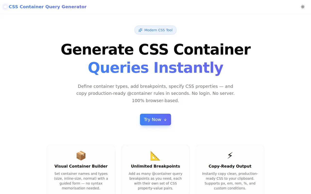
CSS Container Query Generator: Build @container Rules Without Memorising the Syntax
Free online CSS container query generator — define container types, add breakpoints with conditions, specify CSS properties, and copy production-ready @container rules in one click. No signup required.
CSS Container Query Generator: Build @container Rules Without Memorising the Syntax
CSS container queries landed in all major browsers in 2023, and they change how we think about responsive design. Instead of querying the viewport, you query the container — so a card component can adapt to its own width, regardless of where it appears on the page.
The feature is powerful. The syntax is not hard. But it has enough interconnected pieces that many developers look it up every time:
- Is it
container-type: inline-sizeorcontainer-type: size? - Do I need a
container-name? When does it matter? - Does the
@containercondition go in the same block or a separate rule? - Which units can I use in the condition — px, em, both?
The CSS Container Query Generator removes every one of those lookups. Configure the container, add breakpoints, specify properties, copy the CSS.
What Are CSS Container Queries?
A CSS container query lets you apply styles to an element based on the size of its parent container, not the viewport. This is the key shift from media queries:
/* Media query — responds to the viewport */
@media (min-width: 768px) {
  .card { display: grid; }
}

/* Container query — responds to the container */
@container (min-width: 400px) {
  .card-body { display: grid; }
}
With container queries, a component becomes genuinely reusable. The same <Card /> component renders correctly in a 280px sidebar and an 800px main area — because it responds to its own context, not an external measurement.
Why Is the Syntax Tricky in Practice?
Container queries require a two-part setup that developers often forget:
Part 1 — The container declaration (on the parent):
.card-wrapper {
  container-type: inline-size;
  container-name: card; /* optional */
}
Part 2 — The @container rule (targeting the children):
@container card (min-width: 400px) {
  .card-body {
    display: grid;
    grid-template-columns: 1fr 2fr;
  }
}
The parts are easy to separate in your head — and easy to get wrong when you're in the middle of building something. Is container-name in the @container rule or the declaration? (Declaration.) Is inline-size the right choice? (Almost always yes.) Can you skip container-name? (Yes — the query matches the nearest ancestor with container-type set.)
How the Container Query Generator Works
Configure the Container
The left panel starts with the container setup:
Container class name — enter the class that wraps your component. The generator produces .your-class { container-type: ...; } as you type.
container-type — three options, each explained inline:
inline-size— containment on the inline axis (width). The default choice. Lowest performance overhead.size— containment on both axes. Use when you need to query the container's height.normal— no size containment. Useful when you wantcontainer-namefor style queries without size queries.
container-name — optional text field. Leave blank if you have a single container. Add a name when you have nested containers and need to target a specific ancestor.
Add @container Rules
Click "Add Rule" to create a breakpoint. Each rule has:
Condition type — a dropdown with five options:
min-width— apply when container is at least this wide (most common)max-width— apply when container is at most this widemin-height— apply when container is at least this tall (requirescontainer-type: size)max-height— apply when container is at most this tallCustom— free-form condition for combinations like(min-width: 400px) and (max-width: 800px)
Value and unit — numeric input + unit selector (px, em, rem, %). The tool builds the condition string: (min-width: 400px).
Target selector — the child element to style inside this breakpoint. Enter .card-body, h2, .image, etc.
CSS properties — unlimited property-value pairs. Property names have autocomplete suggestions for common properties: display, grid-template-columns, flex-direction, gap, font-size, and more.
Rules can be collapsed to keep the UI clean when you have many breakpoints.
Copy the Generated CSS
The right panel shows the full CSS output as you configure. The output is clean, properly indented, and ready to paste:
.card-wrapper {
  container-type: inline-size;
  container-name: card;
}

@container card (min-width: 400px) {
  .card-body {
    display: grid;
    grid-template-columns: repeat(2, 1fr);
    gap: 1rem;
  }
}

@container card (min-width: 700px) {
  .card-body {
    grid-template-columns: 1fr 2fr;
  }
}
Click "Copy CSS" to copy to clipboard, or "Download .css" to save the file directly.
When Should You Use container-type: size vs inline-size?
This is the most common container query question.
Use inline-size (the default choice) when:
- You only need to query the container's width
- You're building horizontal-flow components (cards, grids, navigation)
- You want the lowest possible performance overhead
Use size when:
- You need to query the container's height —
(min-height: 300px) - You're building components in fixed-height contexts: sidebars, panels, modal bodies
Avoid size when you don't need it — it applies containment on both axes, which has a higher layout cost.
When Do You Need a Named Container?
Unnamed containers work fine when there's one container in the ancestor chain. The @container rule matches the nearest ancestor with container-type set.
Named containers become necessary when:
- You have nested containers
- The child needs to query an outer container, not the nearest parent
.page-layout {
  container-type: inline-size;
  container-name: page;
}

.card-wrapper {
  container-type: inline-size;
  container-name: card;
}

/* This targets the page container, not the card */
@container page (min-width: 1200px) {
  .sidebar { display: none; }
}
Without the name, an unnamed @container rule inside .card-wrapper would match .card-wrapper, not .page-layout.
Real-World Component Examples
Responsive Product Card
.product-card {
  container-type: inline-size;
}

@container (min-width: 320px) {
  .product-card__body {
    display: flex;
    flex-direction: row;
    align-items: center;
  }
}

@container (min-width: 500px) {
  .product-card__image {
    width: 200px;
    height: 200px;
  }
}
Adaptive Navigation
.nav-wrapper {
  container-type: inline-size;
  container-name: nav;
}

@container nav (max-width: 600px) {
  .nav-list {
    flex-direction: column;
    display: none;
  }
  .nav-hamburger {
    display: flex;
  }
}
Design System Typography
.article {
  container-type: inline-size;
}

@container (min-width: 700px) {
  .article h1 { font-size: 2.5rem; }
  .article p { font-size: 1.125rem; line-height: 1.8; }
}

@container (max-width: 699px) {
  .article h1 { font-size: 1.75rem; }
  .article p { font-size: 1rem; line-height: 1.6; }
}
Browser Support in 2026
Container queries have been supported in all major browsers since late 2023:
| Browser | Supported Since | |---------|----------------| | Chrome | 105+ | | Firefox | 110+ | | Safari | 16+ | | Edge | 105+ |
Global support is above 93%. Safe to use in production without fallbacks.
For progressive enhancement in environments that may have older browsers:
@supports (container-type: inline-size) {
  .card { container-type: inline-size; }

  @container (min-width: 400px) {
    .card-body { display: grid; }
  }
}
Why Container Queries Beat Media Queries for Components
| Scenario | Media Queries | Container Queries | |---|---|---| | Card in sidebar | Breaks unless breakpoints match sidebar width | Adapts to sidebar width automatically | | Reusable component | Needs context-specific CSS | Adapts to any context | | Design system | Components need viewport assumptions | Components are truly portable | | A/B layout testing | Requires CSS overrides | Component responds correctly in both layouts |
Container queries don't replace media queries — they complement them. Use media queries for layout-level changes (header nav collapsing at mobile widths), and container queries for component-level changes (card grid switching to a list inside a narrow column).
Try the Container Query Generator
The CSS Container Query Generator is free, requires no signup, and runs entirely in your browser. Nothing is sent to a server.
Open it, configure your container, add breakpoints, copy the CSS.
Live tool: container-query-generator.tools.jagodana.com
GitHub: github.com/Jagodana-Studio-Private-Limited/container-query-generator