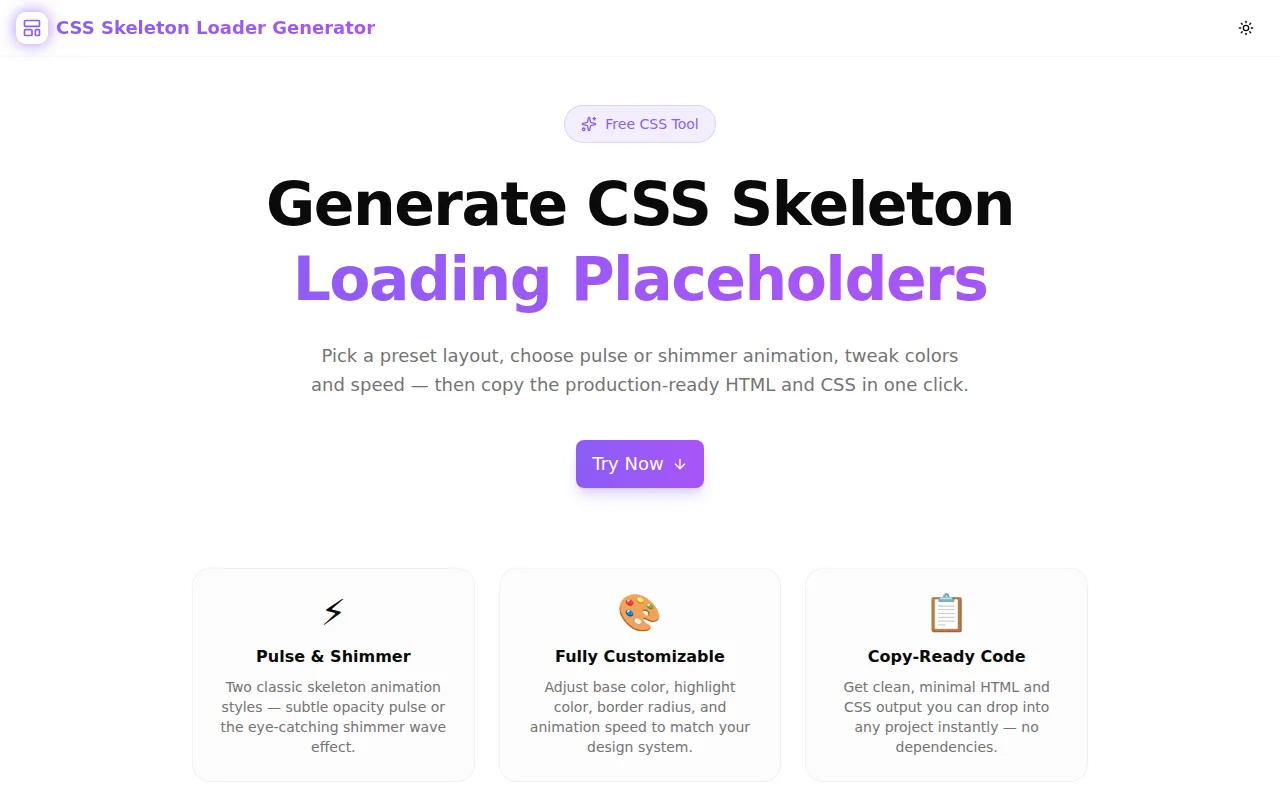
CSS Skeleton Loader Generator: Build Animated Loading Placeholders Without Writing a Single Line of CSS
A free browser tool lets you generate pulse and shimmer CSS skeleton loading placeholders for cards, lists, profiles, articles, and tables — customize colors, speed, and border radius, then copy the zero-dependency HTML and CSS.
CSS Skeleton Loader Generator: Build Animated Loading Placeholders Without Writing a Single Line of CSS
Every web application has a loading state. What happens in that window — between "data requested" and "data rendered" — has a measurable impact on user retention, perceived performance, and overall experience quality.
The pattern that works best is also one of the most frequently deferred: the skeleton screen. A free tool now makes it instant.
CSS Skeleton Loader Generator generates animated CSS loading placeholders in your browser — choose a preset layout, configure animation and colors, and copy production-ready HTML and CSS with one click.
What Is a CSS Skeleton Loader?
A CSS skeleton loader (also called a skeleton screen or content placeholder) is an animated grey shape that fills the space where content will load. Instead of a blank page or a generic spinner, users see a rough outline of the incoming content: rectangles where text will appear, circles where avatars will be, a wide rectangle where an image is loading.
The visual structure tells the user two things at once: "the page is loading" and "here is roughly what you're going to see." That double signal dramatically reduces perceived wait time and anxiety.
Research from Viget and Google's Core Web Vitals work consistently shows that skeleton screens score higher on perceived performance than equivalent pages using spinners or empty states, even when the actual load time is identical.
What Is the Difference Between Pulse and Shimmer Animation?
The two dominant CSS skeleton animation techniques serve slightly different UX goals.
Pulse Animation
Pulse alternates the skeleton element's opacity between full and reduced — typically between opacity: 1 and opacity: 0.4 — on a continuous ease-in-out cycle. The effect is a slow, breathing rhythm that signals "loading in progress" without drawing attention away from other UI elements.
Pulse is best for:
- Data-dense interfaces where the animation should stay in the background
- Applications with dark color schemes where shimmer contrast is harder to achieve
- Cases where you want users to focus on other parts of the UI while waiting
Shimmer Animation
Shimmer moves a bright gradient from left to right across the skeleton element — a translucent highlight band sweeping across the grey base. This is the style used by LinkedIn, Facebook, Google, and most large-scale consumer products.
The shimmer reads as "actively loading" because it mimics a light reflection passing over a surface, which the brain associates with motion and progress. It is more visually engaging than pulse and performs better in user studies on consumer-facing products.
Shimmer is best for:
- Content-first products (social feeds, news, e-commerce listings)
- Light-mode interfaces where the highlight contrast is clear
- Any case where you want the loading state to feel dynamic rather than static
CSS Skeleton Loader Generator supports both. The live preview shows you exactly how each animation looks with your chosen colors before you copy any code.
How Do You Generate a CSS Skeleton Loader for a Card?
The card preset in CSS Skeleton Loader Generator produces a layout with an avatar circle on the left and stacked content lines on the right — the standard pattern for social posts, comment threads, product cards, and notification items.
Steps:
- Open css-skeleton-loader-generator.tools.jagodana.com
- Select the Card preset
- Choose Shimmer or Pulse animation
- Set your base color to match your UI background (default
#e2e8f0works for most light-mode designs) - Adjust border radius — 6–8px for cards, 0px for flat designs
- Click the CSS tab, then Copy CSS
- Click the HTML tab, then Copy HTML
- Paste into your project and apply
.skeletonto any placeholder element
The generated code has zero JavaScript dependencies. The animation runs on @keyframes CSS alone.
How Do You Create a Dark Mode CSS Skeleton Loader?
Dark mode skeleton loaders require inverted color choices from the light mode defaults. Rather than light grey on white, you want a dark neutral on a dark background.
Recommended dark mode settings in the generator:
- Base color:
#1e293b(slate-800) - Highlight color (shimmer):
#334155(slate-700) - Animation: Shimmer at medium speed
The subtle contrast between #1e293b and #334155 produces a dark shimmer that reads clearly without being garish. For very dark backgrounds (#0f172a and below), bump the highlight to #475569 for more visible contrast.
What CSS Does a Shimmer Skeleton Loader Use?
The shimmer skeleton CSS pattern uses a pseudo-element with an absolute-positioned gradient that the @keyframes animation moves from left to right. Here is the core pattern:
.skeleton {
  position: relative;
  background-color: #e2e8f0;
  border-radius: 8px;
  overflow: hidden;
}

.skeleton::after {
  content: '';
  position: absolute;
  inset: 0;
  background: linear-gradient(
    90deg,
    transparent 0%,
    #f8fafc 50%,
    transparent 100%
  );
  animation: skeleton-shimmer 1.5s ease-in-out infinite;
}

@keyframes skeleton-shimmer {
  0%   { transform: translateX(-200%); }
  100% { transform: translateX(200%); }
}
The overflow: hidden on the parent clips the pseudo-element as it travels beyond the element's boundaries. The translateX(-200%) start position ensures the gradient enters from completely off-screen, which is necessary for the sweep to appear smooth at any element width.
The CSS Skeleton Loader Generator produces this exact pattern — with your customized colors, border radius, and animation duration — in the CSS tab.
Which Layout Should I Use for My Use Case?
| Use Case | Recommended Preset | |---|---| | Social feed post, product card, comment | Card | | User directory, notification list, file list | List Items | | Twitter/X-style profile, team page | Profile | | Blog post, news article, documentation page | Article | | Admin dashboard, analytics table, CRM | Data Table |
All five presets produce HTML that uses standard div elements with inline width and height dimensions, making them easy to adapt to any real component structure.
Why Are Skeleton Loaders Better Than Spinners?
The spinner communicates "loading" and nothing else. It gives users no information about what is coming, how long it will take, or how complex the result will be.
The skeleton screen communicates all of this implicitly. A user looking at a card skeleton knows a card is loading — they can see its approximate size, the number of text lines, whether there is an image. Their mental model of the page state is more accurate, so the wait feels shorter and less uncertain.
Research across multiple studies consistently finds:
- Skeleton screens reduce perceived load time by 5–15% compared to equivalent spinner states
- Users rate skeleton screen experiences as faster even when measured load times are identical
- Bounce rates on skeleton-screened loading states are lower than on spinner-based states
The implementation cost for a skeleton screen used to be the barrier. That barrier is now gone.
How to Add a Skeleton Loader to a React Component
Here is a minimal React pattern using the generated code:
function UserCard({ user, loading }: { user: User | null; loading: boolean }) {
  if (loading) {
    return (
      <div className="user-card-skeleton">
        {/* Paste the generated HTML here */}
      </div>
    );
  }

  return (
    <div className="user-card">
      <img src={user.avatar} />
      <h3>{user.name}</h3>
      <p>{user.bio}</p>
    </div>
  );
}
Add the generated CSS to your global stylesheet or a component-level CSS module. The .skeleton class handles the animation; layout dimensions come from the inline style attributes in the generated HTML.
Try It Now
CSS Skeleton Loader Generator is free, requires no account, and runs entirely in your browser. Generate a skeleton loader for your next component in under 60 seconds.
GitHub: github.com/Jagodana-Studio-Private-Limited/css-skeleton-loader-generator